Introduction
Some stats for thought – one in every two apps is uninstalled in 30 days. That’s how short a window you have to convince your app user to stay. And why is that so? There’s been a tectonic shift in how users interact with products. Lengthy, step-by-step tutorials are not what users want to see when launching an app. Especially when the introduction to those features is all over the place, highlighting almost all app features at once.
With the plethora of apps available for any given task, the user is decidedly spoilt for choice and will find genuine value, if not with your app, then somewhere else. Looking for a way around this? How can you help users discover specific content? Or explore features they’re most likely to use? How do they actually go about using the features? You see, the answer to all these questions is – implementing nudges and walkthroughs to help users start using the app actively and make the experience more interactive, beneficial, and delightful. To do that, you must know the in and out of nudges and walkthroughs. And this guide does just that! Everything you need to know is covered in this guide.
Keep reading!
What are nudges?
As outlined in the infamous Nudge Theory, a nudge is a subtle navigator that helps individuals make a decision quickly/guides users toward the most relevant option amongst the multiple choices presented to them.
A nudge in a digital space like a web or a mobile app is a subtle push, visual cue/hint that encourage users to choose the next best action within the product. These nudges are subtle, non-intrusive, and relevant to a user’s context at all times.
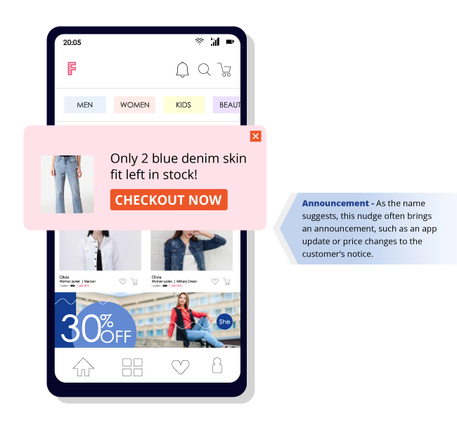
Nudges come in a variety of shapes, colors, and sizes. They can either be instructional or informational, depending on what a user needs at the specific moment. As an example – deploying an instructional nudge is the way to go for highlighting an abandoned cart or maybe a new collection. On the other side, when highlighting a new feature to the user – an informative nudge does the job by describing what the feature does and how to use it.
Having said that, the common element across all nudge types is the whole context. Context of who the user is, stage of the app journey, specific JTBD, attribute data, behavioral data (past actions), and more. It brings you higher engagements, smoother onboarding, better feature adoption, lesser drop-offs, and faster conversions. What do all these mean in the end? O f course, higher retention. Is that not our sweet spot?
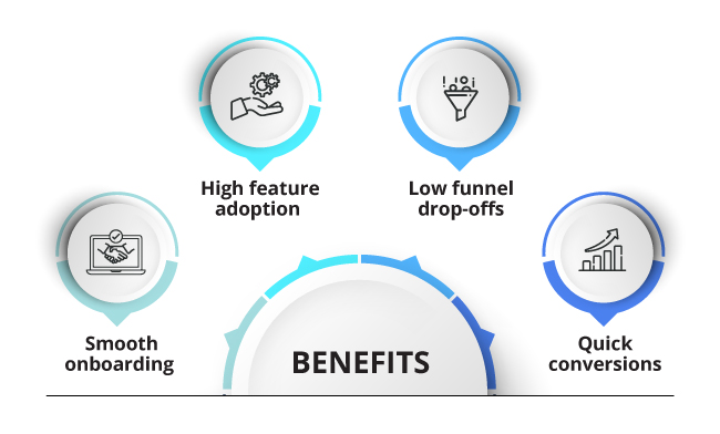
Let’s take a deeper look into what nudges exactly solve with a simple use case:
Let’s say your user is on your ecommerce mobile app and is looking to get a great dress for an evening out. When they browse through the product listing page, a nudge highlighting a discount shows up next to the product. This prompts an action from the user’s end, who clicks on the nudge to move to the next step. A second nudge suggests the user to choose the same size as the last time. Ideally, this reduces cognitive overload (where users can avoid making decisions and simply do what the app suggests), making it so much easier for them to complete a purchase. That’s how powerful nudges are in shaping intelligent conversations that drive conversions.
More about nudge theory: https://netcorecloud.com/blog/roadmap-to-delightful-user-experience/
The nudge library
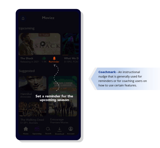
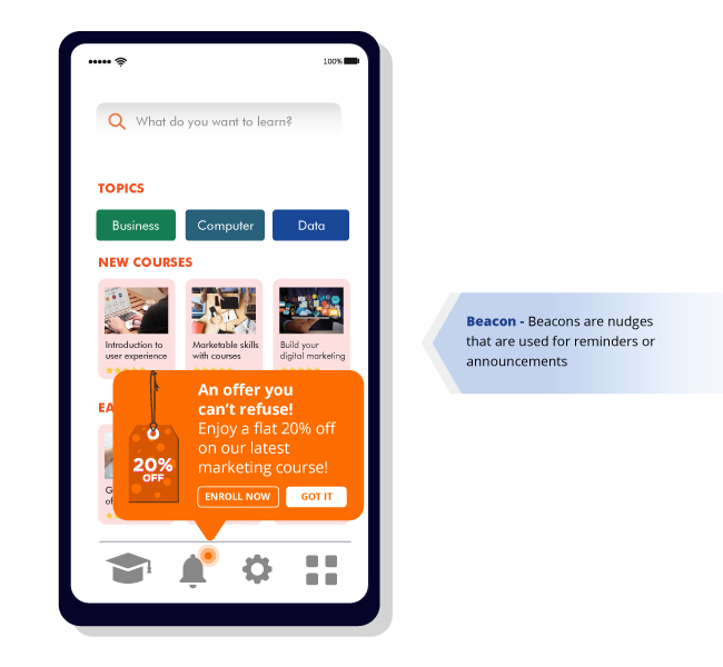
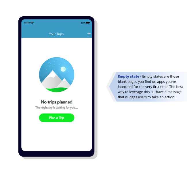
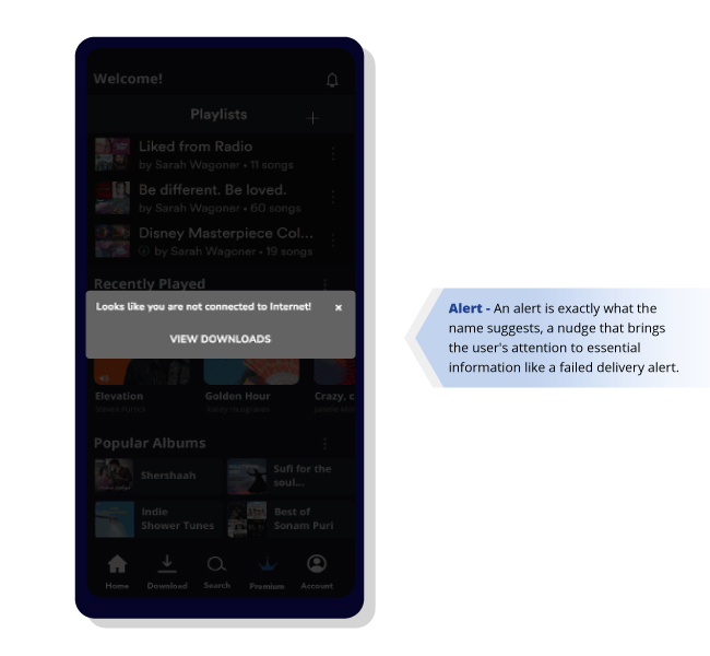
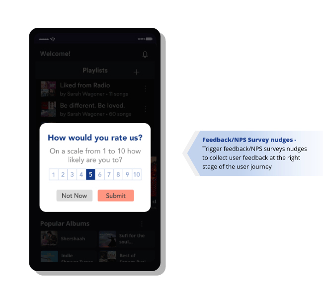
Getting a user to click through your app and use every relevant feature you roll out requires some persuasion. The reason being – users are bound by habits. We continue doing the same thing repeatedly and resist any changes. Nudges work their magic here – they positively alter user behavior and motivate users to take the best actions for them. We’ve studied over 300 different types of nudges, which can be broadly brought down to a few types across 9 different industries.
What are walkthroughs?
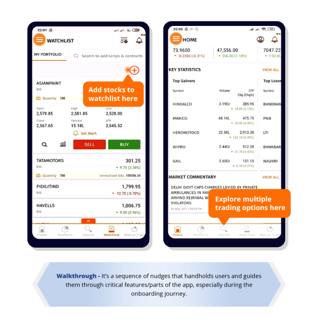
In the simplest form, walkthroughs are nothing but a contextual sequence/series of nudges that take users from one step to the other. Walkthroughs drive better onboarding experiences by getting users acquainted with the app quickly. In fact, even for existing users, mini walkthroughs letting users in on the know-how of, say, a new feature is where walkthroughs make an excellent tool for increasing user engagement, feature adoption, product stickiness, and overall retention.
A slightly old-school thought would tell you that good apps don’t need walkthroughs. It seems logical, doesn’t it? If you’ve created a great app, why do you need a walkthrough to direct/explain to users what to do next? Won’t the app do that for you? But here’s the real deal – walkthroughs are created to help users achieve their goals, and they’re made contextual to create relevant user-preferred experiences.
For example, when the user is on the app for the first time, it is crucial to handhold them, take them through the hero features one at a time, and bring them closer to the value the app delivers. This is nothing but a well-curated onboarding experience. With users delighted right at the beginning of their journey with the app, product and growth managers can fight the dreaded D0 churn.
There’s an insane amount of time, money, and resources spent on developing a single feature, let alone developing an app. And then imagine all of this going downhill only because users failed to discover the core features/understand how the app works. It’s a trickle-down effect; when users don’t find valuable features easily, they tend to engage less and wouldn’t be too excited to come to the app the next time. And this ultimately results in churned users.
But here’s the good news – using contextual nudges and walkthroughs across different user journey stages can prevent all of this. Well-placed, timely nudges and walkthroughs boost feature adoption and contribute to all key growth metrics.
Here’s a little more on How walkthroughs boost feature adoption.
Bonus read: 4 ways to create delightful B2C mobile app walkthroughs
How are contextual nudges and walkthroughs different from in-app messages?
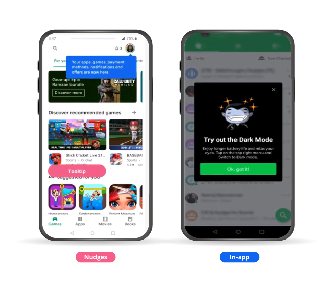
The contextual nudge is a navigation element that simplifies the user journey, and a great walkthrough comprises a series of such contextual nudges. Against these are the screen-blocking, force-fitting pop-ups.
In-apps are the one-sided announcements that interrupt the user flow, unlike nudges, which are non-intruding and more relevant at a specific moment.
Of course, in-app messages do solve multiple use cases like delivering certain essential information to users in a way they can’t ignore. But even with their own set of benefits, here is where in-app messages fail and nudges and walkthroughs take over:
1. Delivering a hassle-free user experience
The apparent difference in the look and feel between nudges and in-app messages makes nudges a better driver of user experience. By being subtle and tied to a specific app element, nudges let users continue using the app and simultaneously grab the user’s attention. In-app messages, on the contrary, are usually flashy pop-ups occupying at least half of the mobile screen and force users to take notice and, in the process, hampers the user flow and overall product experience.
2. Nudges are more versatile and user friendly
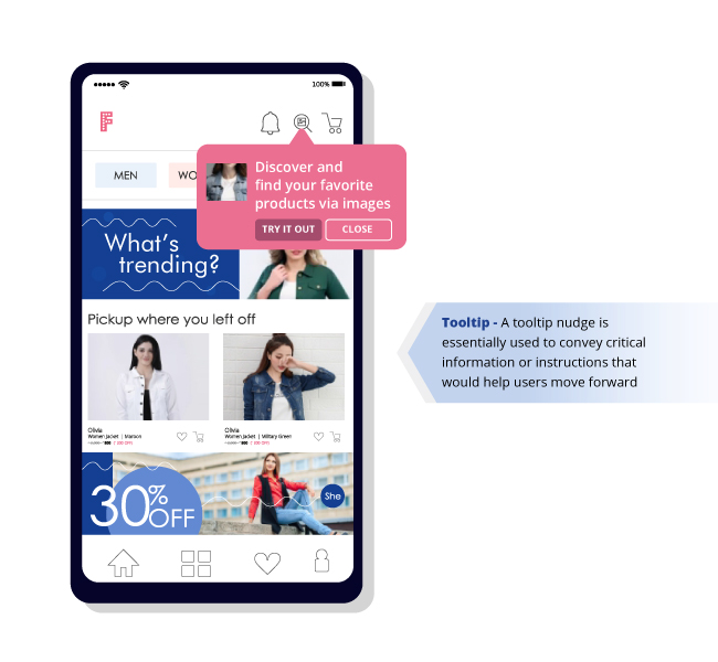
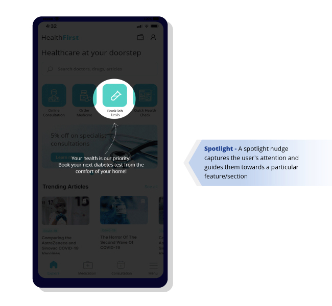
Nudges come in different forms, and each one is just as appealing to the user as they are highly contextual. It could be a spotlight highlighting information, a tooltip displaying suggestions, or a coach mark giving guidance on specific issues. Our nudge library has an in-exhaustive list of nudges solving multiple use cases for brands across industries.
4. Latency and internet connectivity needs
Nudges and walkthroughs can be activated on the user’s end without accessing the internet. Where the user context and purchase intent can change in a matter of seconds, this is a key differentiator. In-app messages on the other hand are triggered by server-to-server interaction and therefore require a constant connection to the internet.
Learn more about how nudges are better than in-app messages when it comes to delivering contextual user experiences: https://netcorecloud.com/blog/in-app-messaging-vs-nudges-for-user-experience/
Metrics impacted by nudges and walkthroughs
Nudges and walkthroughs have a significant impact on key business goals and metrics. Let’s look at each of those below:
User Retention
User retention is the ability of a mobile-enabled business to retain its mobile app users over a period of time. In simple terms, user retention is getting your users to keep using your app. “User retention is the ultimate measure of whether everything your mobile product, messaging, and overall experience is working.” Hila Qu, VP of Growth at Acorns. User retention has to be the north star metric for data driven product leaders. While acquisition is crucial in growing your mobile app business, your focus should gradually shift towards a retention-first approach in your product growth strategy.
Here is your ultimate guide with actionable tips to cracking mobile app user retention https://netcorecloud.com/ebook/mobile-app-user-retention/
Day 0 retention
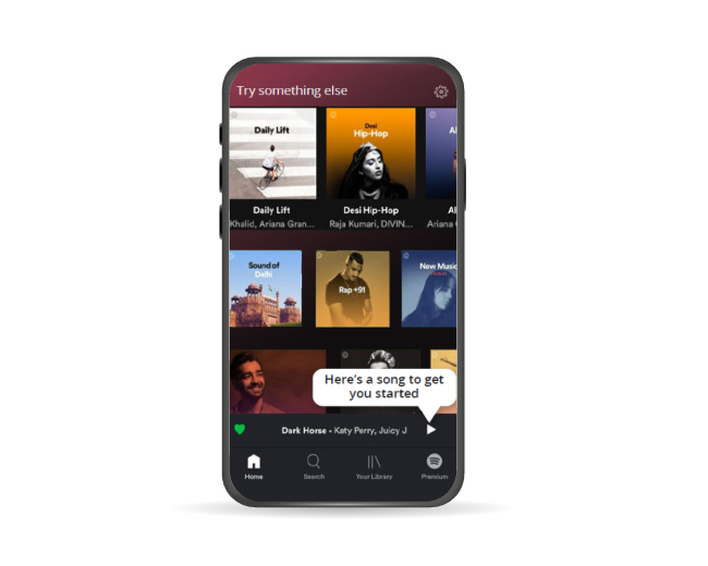
Day 0 retention rates largely depend on how fast you deliver value to users. Realizing value comes from discovering app features that solve major pain points and navigating the app seamlessly. With contextual nudges and walkthroughs, you can offer on-the-go guidance to users and lead them to the activation point. This increases your chances of getting users back on the app beyond Day 0.
Guide your users with better onboarding through contextual nudges and onboarding tours (walkthroughs) that quickly get users started on the app. This takes the user closer to their aha moment and significantly boosts Day 0 retention rates.
Some use cases here could be:
→ Getting users to sign up
→ Nudging users to fill in their profile details (to get more context on the user and engage them in the most relevant manner)
→ Encouraging users to browse through the product listings page
→ Prompting them to consume content and much more.
Depending on the industry, you can explore actionable use cases to drive up your retention rates starting at Day 0.
Here’s a quick read on how nudges help drive users to their aha moment https://netcorecloud.com/blog/app-users-journey-to-aha-moment-with-nudges/
Feature adoption
Feature adoption refers to driving continuous usage of app features. It’s a key indicator of product stickiness, product adoption, and overall engagement and remains a road blocker for almost all apps (even the big guns). The first hurdle is feature discovery. Many of the features go by unnoticed, which in turn has a negative impact on feature adoption rates. By deploying nudges that grab the users’ attention towards these features and encourage them to take action around them, you can help users build habit loops that trigger them to keep engaging with the feature and drive adoption.
Strategies to drive feature adoption: https://netcorecloud.com/blog/blog-10-strategies-feature-adoption/
User Engagement
Improve user engagement on your app by communicating the right message at the right time with a subtle nudge. Some ways you can boost engagement are by:
- Using nudges to remind users to pay bills, recharge essential services, or renew subscriptions.
- Gamify the app experience by using rewards/progress bars/checklists. Put a spotlight on deals/offers that a user would not want to miss out on. Promote trending and relevant content based on the user’s taste and preferences
- Putting a spotlight on deals/offers that a user would not want to miss out on
- Promoting trending and relevant content based on the users taste and preferences
We’ve put together a comprehensive ebook on how you can scale your app to millions of users by increasing user engagement: https://netcorecloud.com/en/ebook/user-engagement-guide-for-mobile-app-growth/
Funnel conversions
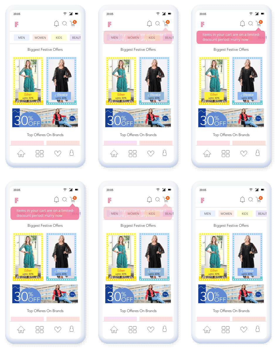
Map out your user journey to identify potential friction/drop-off points and place nudges at the relevant points to keep users from leaving. The most common user journey for, say, an ecommerce app would be login/sign-up to checkout. The possible drop-off points could be the sign-up process (when it is complex and lengthy) or cart abandonment (the next-door neighbor of almost every ecommerce app). The approach here would be to keep the sign-in process simple and nudge users to checkout by either showing limited-time discounts, social proofing (the number of people browsing this product or the number of people who have bought this say in the last 24 hours), or even an item running out of stock alert. Subtly nudging users at these stages can help optimize funnel conversions to a great extent.
User experience
Perhaps, the most crucial piece of the puzzle – is user experience. As Steve Jobs said, “Design is not just about what it looks like, and feels like. Design is about how it works”. This focuses on the parts of the user experience that complement the app’s design, like the ease of navigation and interactive app flows. Retaining users is a long innings game and can be won only by prioritizing user experience. The sheer appearance of nudges (in terms of the shape, size, tied to specific app elements, font style, type, and more such customization areas) compliments the design aspect of the app and improves the overall user experience.
The need for building context
Why does context matter?
Context leads to intelligent conversations. Gathering user data from multiple sources helps you put things in perspective – giving you a complete overview of the what, where, when, and how of engaging users.
When backed by data, every conversation/communication with every user becomes hyper-personalized. And what does this lead to? The obvious answer – better engagement rates and higher conversions. Nudges and walkthroughs are no good if they aren’t contextual. Triggering a random nudge is nothing but just another blast of impersonal and irrelevant communication for users. ‘Uh, what’ is not the reaction you want from users when you nudge them towards a new feature or any aspect of the app. Instead, you want your users to feel ‘Ah, yes’ and actually engage with the nudge. And this is exactly where context is needed.
Now, the next thing to know about context is how to go about building it?
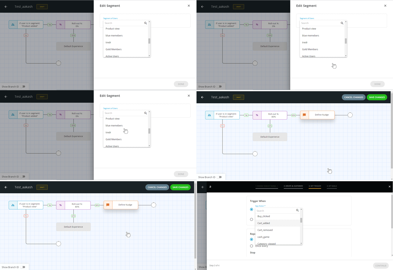
Setting the user context requires stitching data from multiple channels, analyzing user behavior patterns, breaking down every user interaction into an insight, creating user segments, and building user journeys/flow on the app. Depending on where your user is in the user journey, you then trigger the most relevant nudges at that point. A simple instance of this would be – nudging users to add products to the wishlist as they browse through the app. Or highlight the search feature when a user is on the product listing page. Or even nudging users to pick up where they left off the next time they launch the app.
Nudging a regular user to upgrade their account/subscribe to premium vs. prompting a first-time user to pay up – Now you know why context runs the show. Without it, you’re less likely to drive meaningful engagements that result in conversions and retention in the long haul.
What you shouldn’t do when implementing nudges and walkthroughs
While we talk a lot about using nudges, it’s also important to point out what not to do. Below are the big no’s:
1. Relying on a one-size-fits-all approach
Users are always on the lookout for 1:1 delightful experiences. Make sure that you nudge users in a customized way. Just like in a coffee shop, everyone does not order espresso. Some might want a latte while others a cappuccino. Because every user expects something different from the same app, understand and craft an experience based on their motivations and their abilities. If you fail to do that, they will churn.
2. Crafting lengthy walkthroughs
Walkthroughs work when they’re short and to the point. There’s a fine line between hand-holding users and overburdening them with information. Adding multiple nudges or steps in the walkthroughs might confuse and annoy users. Throwing too much information at users makes it difficult to recall the important ones. The focus should always be on showing users the most important features/parts of the app to help users meet their needs/goals.
3. Triggering multiple nudges at one-go
It’s always tempting to introduce all the features to users at once. The result? A single-screen crowded with arrows and nudges – failing to get the user’s attention. The best way to approach this is – to place nudges as users keep navigating the app. Depending on what the user clicks, you display the relevant nudge.
4. Forcing users to sit through the walkthrough
Mandatory app walkthroughs make users fall down the valley of despair. Always allow users to skip or check them later. This also stems from the fact that users prefer figuring out the app themselves, and many a time, they already know their way around it. Force-fitting a walkthrough in such cases gets users to uninstall the apps. Skippable walkthroughs are always a safe bet!
Industry use cases – How leading brands are using nudges to drive growth
BYJU’S
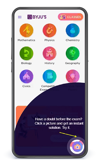
BYJU’S, a leading edtech platform achieved a 1/3rd increase in feature adoption by using contextual nudges to help users discover and adopt the Q&A feature quickly. By highlighting the actions/steps a user needs to take to use the feature, BYJU’S was able to drive high feature discovery and adoption for a critical feature.
To further measure the impact of nudges on the feature adoption metric, we helped the edtech giant conduct rapid low-code segment-specific A/B tests and measure how nudges increase interactions with features.
Mayani
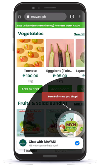
Mayani, an agritech platform, sees an 8.5X boost in feature adoption for it’s loyalty program by deploying a no-code spotlight nudge once in every 2 sessions.
The major pain point for Mayani was users finding it difficult to notice the loyalty program feature amidst the multitude of features present on the app.
Our nudges helped Mayani’s users discover the feature and explore the loyalty program feature and enjoy a superior product experience throughout.
Language Curry
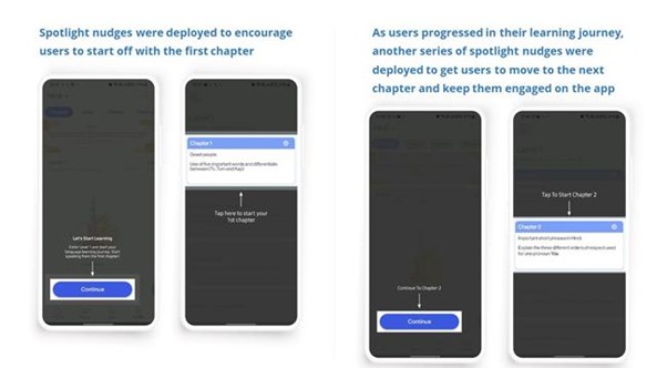
Language Curry, a language learining portal, experiences a 93.64% increase in user engagement by building no-code nudge journeys for users.
Lack of bandwidth and resources to create multiple user segments made it difficult for Language Curry to build personalized experiences for every user. The main aim was to create engaging onboarding journeys for new users and contextually engage exisitng users to level up in their learning journey.
To help them achieve this goal, we created spotlight nudge journeys for each user based on their learning stage/progress.
Pagarkhata
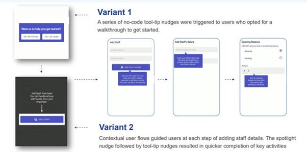
Pagarkhata, an employee management app by Khatabook, achieved a 3.5x increase in user activation by using Netcore’s No-Code Product Experience Platform. The major challenge faced by the MSME was low product adoption owing to a poor onboarding flow.
Their goal was to test and optimize the user journey on the app that would get users to complete critical tasks such as adding new employees to the list of workforce members.
We helped PagarKhata conduct rapid multivariate A/B testing across the onboarding journey. A series of tooltip nudges were deployed for any user who opted for a walkthrough, making the user’s experience much more contextual. And the best part, no code was used to get it up and running. After analyzing both the variant’s results, PagarKhata could deploy the one that showed the best results.
Access the full case study: https://netcorecloud.com/success-story/pagarkhata-app/
Kumu
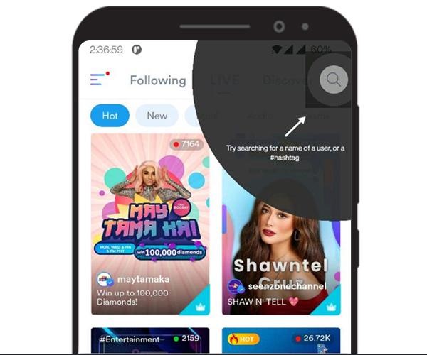
Kumu, a Filipino entertainment app with live streaming and over 100 million users, saw an increase in feature adoption by 38%. The app faced low adoption for its search feature primarily because users failed to discover it quickly. With this, users also found it difficult to quickly access relevant content, leading to low engagement on the app.
By deploying a no-code spotlight nudge, Kumu highlighted the search feature, which resulted in as many as 54% of the users clicking and using the feature.
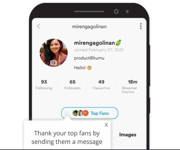
They tied a tool-tip nudge to the ‘Thank you message’ feature that streamers could send to their fans to drive engagement further. Nearly 48% of users ended up sending out thank you messages which further boosted app engagement.
Read the full case study here: https://netcorecloud.com/en/success-story/kumu/
Build vs buy
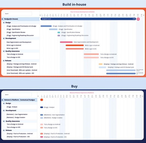
Hard-coding is a thing of the past, now that we have so many no-code/low-code tools changing the way product and growth owners engage, convert and retain users. The hard coding nudges into your mobile app and the traditional way of building these nudges pose the following challenges:
→ Long product release cycles
→ Worry of app releases
→ High dependency on developers/engineers
But all of this back and forth can be avoided using a single no-code tool. You save up on countless number of development hours, you’re free of all your app release worries, and you can deploy highly contextual nudges and walkthroughs in as less as 15 minutes.
Let’s skip to the good part: Deploying real-time nudges in under 15 minutes using the no-code platform
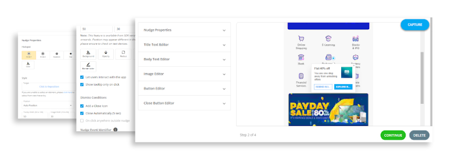
This really is the good part: Deploying nudges & walkthroughs couldn’t get simpler. Implementing these might seem painstaking in a hard-coding world, but it isn’t in the no-code world. A simple 2-step SDK Integration and 15 minutes are all you need to trigger real-time segment-specific nudges & walkthroughs on your app.
All the worry about app releases, integration efforts, implementation time, and resources ends now! With a drag and drop journey builder, you can easily map out unique, personalized nudges & walkthrough flows for every user segment and run rapid low-code experiments to understand what’s working and what’s not. The in-depth reporting and analytics feature helps you set measurable goals (in terms of conversion, adoption, engagement, and more), measure outcomes, iterate and improvize to lead app growth.
The extra agility and speed offered to product teams help you invest your time and resources in better understanding user needs, developing features users would prefer, and create the best version of your app.
Excited to experience the platform? Connect with us now!
FAQs
1. What is nudge in application?
In-app nudges are visual cues within the app that guide users without distrubing their flow or experience on the app. They come in the form of tool-tips, spotlight, coachmark, alerts etc that suggest the next best action to users.
2. How does the nudge theory work?
Nudge theory is based on common user psychology or behaviour where users tend to avoid decision making and any option that is highlighted to users above others increases the likelihood of users choosing that option.
3. Why is nudging important?
App users are most likely to take an action when it is offered as an elevated suggestion. Nudging has proved to be effective in multiple areas be it reducing the littering rate by placing green footprints that lead to the dustbin or placing footprints on the staircase to prevent people from using the escalator. Nudging has the same effect in the digital world too. With multiple features present on the app, users tend to get confused. When certain core features are highlighted to users and contextual guidance is given on the next steps, users tend to take those actions.


