


Haven’t most of us downloaded apps with a lot of excitement, only to be disappointed within the first few seconds?
Those few seconds a user spends on the app set the expectation for the entire app journey. When users get lost on the app or are unable to navigate to the right features, the time-to-value increases and users end up not getting the value for which they installed the app.
Just like ‘a penny saved is a penny earned, ‘ a second saved is a second earned.’ That’s why onboarding experiences become a pivotal point in the app user’s journey. This is where contextual walkthroughs step in and help create relevant and engaging first-time user experiences that reduce the time-to-value.
The bottom line is – It’s all about the first impression. The way app users feel during their first interaction is crucial, and if you can’t get it right the first time, chances are that there won’t be a second time.
What are contextual walkthroughs?
When it comes to convincing a user about the app’s value proposition – the amount and type of information displayed make a lot of difference. Onboarding (in the traditional sense) strategies tend to overload users with information in initial app interactions, and that overwhelms users.
The urge to introduce all features/functionalities is a common tendency in the app space and should be avoided. Depending on context, the onboarding experience should be tailored to introduce information that is relevant and necessary for users to get started and get to the ‘aha moment.’
Enter contextual walkthroughs – the more viable form of product tours.
Unlike product tours that target displaying all the available features of the app, contextual walkthroughs do not give an information overload to the users.
Walkthroughs are contextual and interactive. They let users experience the product in a way that makes them realize the value in the initial stage.
Contextual walkthroughs are a well-drafted sequence of nudges, with relevance to the user as the prime parameter.
A walkthrough navigates users through the app. They highlight the right features and the next best action they can take to derive the most value out of the app.
Top brands, like Google, are successfully doing this across their products by introducing the most relevant and sticky features to users at their high-intent moments. Giving them the necessary guidance to take meaningful actions makes them discover their ‘aha moments’ much faster.
Users are certainly not always intuitive enough to figure out the app all by themselves. And in such times, walkthroughs do the job.
Why are contextual walkthroughs important?
Data shows that most uninstalls take place on the very first day of installing the app. In 2020, apps lost $57,000 per month because of uninstalls – a report by Appsflyer.
This is enough for product managers to consider onboarding a critical part of determining whether the app is just a ‘good-to-have’ or a ‘can’t do without.’
Contextual walkthroughs is undoubtedly crucial in steering this whole app onboarding experience and setting the stage for the remaining app journey.
For users to consider using your app, they should realize the core value and benefits of the app in the early stages of onboarding. The faster they recognize the app’s value, the more likely they are to stick around.
By telling users how to perform key relevant actions on the app, contextual walkthroughs are able to drive users to this ‘aha moment’ quicker and in a seamless manner.
Not every user would interact with the app in the same way. So depending upon the user persona and the user’s job-to-be-done, these walkthroughs are triggered to reduce the time-to-value and deliver a unique FTUE (first-time user experience).
Key performance metrics that contextual walkthroughs help improve
1. Day 0 retention
Day 0 uninstalls remain a grim problem for many apps across various industries. If users don’t realize the app’s value on all fronts, they simply uninstall the app and move on to the next one. Hence retaining users on Day 0 is a major concern that all product managers need to address.
With walkthroughs, users are clearly aware of how the app benefits them, and as a result users tend to stick around much beyond Day 0.
Related read – Contextual nudges & walkthroughs: The new app retention catalyst
2. User activation
As walkthroughs help users explore the app at the moment they’re most motivated to, users tend to experience the ‘aha moment’ in the first few interactions and reach the activation point quickly.
Related Read: 5 psychological triggers to spark a successful user activation – Netcore (netcorecloud.com)
3. Feature discovery and adoption
More often than not, app features go unnoticed. Owing to the momentum behavior in users that tends to make them resistant towards any change, users tend to keep coming back to a select few features while major app functionalities/capabilities go unnoticed and underutilized.
Walkthroughs help users discover relevant features easily and lay out the specific set of meaningful actions users need to take to get the most out of these features, which in turn helps mobile apps drive up feature discovery & adoption.
To learn more about feature adoption, grab this ebook:
Feature Adoption 101: The Product Manager’s Guide
4. User engagement
Humans have an attention span less than that of a goldfish. Yes, you’ve read that right. Over the years, the sheer amount of information that users come across on a daily basis has led the user’s attention span to drop to about 8 seconds.
If you’re unable to grab their attention within the first few seconds of the app launch, you’re likely to lose them as customers.
Contextual walkthroughs help capture the user’s attention towards those parts of the app that meet their specific needs. This keeps the users engaged on the app for a longer time.
Key practices around walkthroughs to enhance app user onboarding
1. Context is everything
There are N number of things a user can do on an app. Product managers need to identify the context in which a user has downloaded the app because that’s what drives users to behave in a certain way or take certain actions on the app.
Place a sequence of contextual nudges to introduce app features to different user cohorts. Based on the user journey mapping, you introduce a feature that is most relevant at that point in time.
Thus, adding context to the whole app onboarding experience. Nudges are an extremely subtle way of doing so without interrupting the user’s experience on the app.
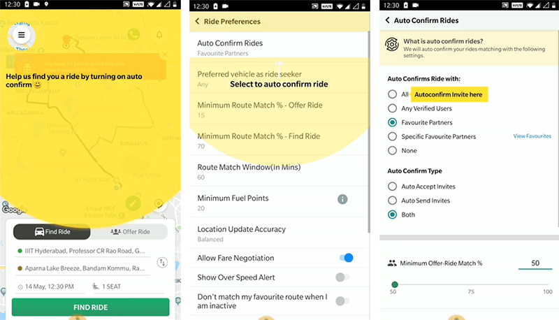
Here’s a quick example of how Quickride, India’s leading ride-sharing app, walks users through a critical feature – ‘auto confirm’
Walkthroughs can be a combination of different types of nudges like spotlight, coach marks, tool tips, and more, or simply a series of informational tool tips that give users the necessary information they need to perform important actions on the app and get the desired value out of it.
To know more about nudges, read this blog on –The what, how and why of nudges
2. Make the walkthroughs interactive
While we talk about placing nudges in the forms of tool tips, spotlights, beacons, and more, it’s important to make these walkthroughs interactive, where users actually get a feel of the app. Let users take action during the walkthrough to keep them more engaged.
With the reduced attention span, apps try to make it easy for users to use the app. In doing so, they tend to eliminate most of the thinking from it.
The problem here is that it makes it difficult to retain users in the long run. The point is that you want your users to actually understand the core value of the app in and out to keep them hooked to your app.
An interesting study on how people valued objects was conducted by researchers Dan Ariely, Michael Norton and Daniel Mochon. They realized that the reason why people value IKEA furniture so much is because of the effort they put in and their amount of participation in putting together the piece of furniture.
This is also applicable to apps. When users tend to spend some effort in discovering the app, they feel more invested in it and they value it more.
While it’s important to reduce the friction in app usage, it’s equally important to let users perform some critical actions on the app to keep them engaged throughout.
3. Resist the urge to show all the app features
Too much information overwhelms users, and they struggle to find the information/locate app features that would be relevant to them.
It’s also not enough to just show some features to the users. It’s important to convince users about the app’s value and highlight the major benefits of using the app. You then show users the critical app features that would best serve users in finishing off important tasks on the app.
4. Practice Personalization
The best on-boarding experiences are ones that are personalized.
Mobile apps personalize user experience based on user preferences right from the first app launch. Take Spotify, one of the world’s largest music streaming services, for instance – based on multiple factors like language, artist, and genre, they’re able to direct users to the most relevant content on the app.

Amazon and Netflix are at the top of their game when it comes to personalized onboarding.
A personalized walkthrough is one which is triggered based on the user’s goal. For instance, Headspace, a meditation app, asks users about their experience with meditation, the reason behind using the app, and when they want to meditate.
And depending upon the answers, users can build a tailored schedule with utmost ease. The whole process feels much more personalized now.
5. Keep the walkthroughs short and simple
You don’t want the walkthroughs to feel overbearing. The best approach is to identify the mission-critical steps and keep the walkthrough limited to that.
When given multiple choices, users tend to choose the one that is elevated to them.
The contextual walkthroughs should give clear directions to users throughout and answer the question -’ What to do next?’. By explaining the next step, you’re able to get users to take actions on the app that you want them to take by contextually guiding them at every step.
6. Own the walkthroughs with zero dependency on developers
No-code platforms help deploy contextual walkthroughs without writing a single line of code and in as little as 15 minutes. This gives product teams the much-needed speed and agility to implement walkthroughs.
Conclusion
On average, a user has 80+ apps installed on their smartphones. Out of that, they actually end up using 9 per day and 30 in a month.
Users are saturated with apps, and breaking through this is difficult. To get users to come on to the app more than once, it’s important to build a habit loop that will encourage users to engage with your apps repeatedly.
At the end of these walkthroughs, users are highly likely to adopt the app in their daily habits and make it to the user’s list of favorite everyday apps.
Want to know more? Feel free to connect with us!
