


Well, if you are here, you are most likely a mobile app marketer. And you must be well aware that feature adoption and app retention are among the top challenges most mobile marketers have been facing these days.
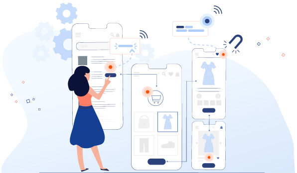
Just imagine you have rolled out a ground-breaking feature on your mobile app after months of strategy and development work. This feature could take your app engagement and retention rate through the roof. But your customers have not been able to locate or make the most of this feature.
And even if they do figure out or use that feature with your marketing efforts, which indeed is very expensive, it happens at a pace that is as good as not happening at all.
Heartbreaking, right? But you know what they say? There is always a solution. Always.
And, in this particular scenario, the solution is app walkthrough, which can boost your feature discovery and day 0 retention by a minimum of 12 to 15%. Yes! app walkthroughs can decide the future of your newly rolled out feature.
What are app walkthroughs?
To understand app walkthroughs, let’s first quickly understand contextual nudges.
Nudges are customized navigators that guide your users when they are on your app for the first time. Nudges help your users to take the next best action and form habit loops. Also, nudges are quite helpful when it comes to introducing your existing users to your newly rolled out feature.
So, when you team up your nudges with relevance and context, they become contextual nudges. And remember, nudges without context are nothing but nags.
When you execute nudges in a sequence to guide your users to your app’s hero feature, they are called app walkthroughs. Simply put, app walkthroughs are multi-step guides that you can integrate into your app’s interface to guide users through specific features or to simply onboard the new users. Did you know that Day 0 retention can be 13% higher with an onboarding walkthrough?
There are five different types of nudges including coach marks, spotlights, beacons, tooltips, info tips. They all serve a different purpose. Read details here.
Now you might be able to connect dots between app walkthroughs and feature adoption loosely. If not, let’s first understand feature adoption. And later, how walkthroughs can boost your app’s feature adoption.
Recommended read: Everything you need to know about App walkthroughs
What is feature adoption and why does it matter?
When you can communicate to your users about the benefits they will reap from your new features and can encourage them to use and re-use those features until they get habitual, it’s called feature adoption.
Basically, when your users understand your new feature and start using it to their benefit, it means they have successfully adopted the feature.
Feature adoption matters because it has a direct impact on your app retention rate. People stick around when they find some value in your product. And the more features your users use, the more value they find from your app. The fewer features they use, the less value they get for their money.
The lesser the value your users get, the more would be your app churn rate.
So if you can track your feature adoption rate, you will get the answers to why certain features are a big hit and why some of the features are not so popular among your users. This will empower you to optimize your app at a very specific touchpoint, feature by feature.
Feature adoption funnel
As a product marketer, you need to know that your users repel changes and they resist coming out of their comfort zone. You need to take the onus of understanding their psychology and encourage them to use features that are relevant to other user cohorts.
From their introduction to a new feature to repeatedly coming back to it, your regular customers go through multiple stages in the feature adoption funnel.
So here’s how your feature adoption funnel should look like when you roll out a new feature.
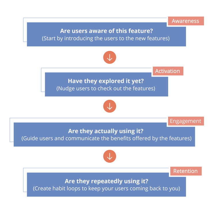
Pinning this funnel to your feature adoption efforts will help you engage the right set of users with the right features with the right communication and at the right time, always!
To know more about feature adoption analytics and its impact, Read this Product Manager’s guide on Feature Adoption 101
How to boost feature adoption with nudges and app walkthroughs
If you really want to succeed at feature adoption, you would not just want to stop at introducing the feature with the help of nudges such as beacons, spotlights, or tooltips. It’s important to lay out a clear path for your users to communicate how to use a specific feature. This can be done through app walkthroughs, which help them drive the maximum value out of your new feature.
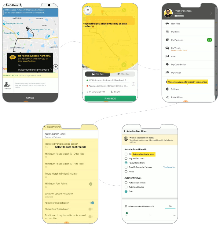
Here’s an insightful use case of an app called Quick Ride that used contextual walkthrough to increase feature adoption by 8X.
Quick Ride, India’s number one carpooling app, wanted more users to take more rides. But when any of their users could not find a rider, they would tend to cancel the app and drop off.
So they launched a new feature called “Auto Confirm” on their app. How did they guide their users to this feature?
With the help of a contextual walkthrough, the users who couldn’t find a ride were guided step by step to discover the “auto confirm” feature on the app. By giving them proper guidance at every step, Quick Ride was able to increase their feature adoption by 8X. Also, they could prevent their users from dropping off the app.
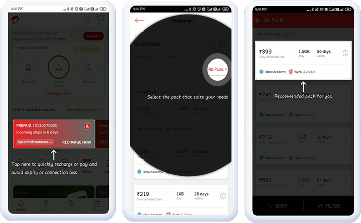
Here’s another brilliant use case from the telecom giant Airtel, which guided its particular segment of users (the ones who were nearing recharge expiry) to payment pages with a series of contextual nudges – a walkthrough.
It starts with a recharge reminder that appears as a coach mark. Thereafter, an eye-catching spotlight guides the user to choose from the multiple recharge plans. To further add a touch of personalization, the app elevated the recommended pack option as a coach mark, to the users. By guiding the users through this whole process, Airtel increased its chance of getting more and more users to recharge their packs.
Contextual nudges and app walkthroughs not only help boost feature adoption but also offer a delightful and memorable customer experience. Goes without saying, feature adoption will always pave the way for a higher app retention rate in the long run.
But here is something that you need to know before using nudges and walkthroughs for your customers.
What not to do when using nudges and contextual walkthroughs
I would like to start this off with a sad but interesting story of Clippit (commonly known as Clippy), the default Office Assistant of Microsoft (2002 to 2003). Clippy was so eager to assist people with their menial tasks that he couldn’t take the hint that he was prying. While Clippy’s intention was good, its unannounced drop-ins annoyed users to the hilt. Microsoft officially fired this overly eager assistant in 2007. Its last words were “It looks like you’re writing a letter. Would you like help?”
I know it’s sad but if Clippy had offered its help based on the user’s behavior and engagement, its fate would have been different. A Microsoft employee attributed Clippy’s fatal flaw to being “optimized for first use” – it was only suitable for first-time or novice users.
So here is what you need to learn from our clingy friend Clippy. Your app walkthroughs and nudges should be well-timed, segmented, contextual and relevant. If you keep nudging users without offering actual value, they will churn out.
Did you know that with the right nudges, the CTR and thereby conversions can improve by up to 20%?
So Here’s what you shouldn’t do when implementing app walkthroughs.
1. Doing it for everyone
Targeting your nudges to the right segment is the key to building delightful experiences for customers. Every user comes with a certain kind of expectation from your app. If you fail to meet that, they will drop off. For example, you are a postpaid customer who goes to your telecom operator’s app to make a bill payment, but the app walkthrough directs you to the prepaid recharge feature. Won’t that be a big disappointment?
2. Including too many steps
While giving a walkthrough to your customers with the help of tooltips, coach marks, spotlights, and beacons don’t lose their attention by including too many steps in the process. Generating a little curiosity is fine but overdoing it can definitely backfire.
3. Too many nudges/coach marks/tooltips on a single screen
Now your app might have a lot of useful features for different users. This does not mean you can have multiple nudges or coach marks or tooltips on a single screen directing the user to different features. This won’t serve any purpose, instead, your users will end up confused.
4. Not providing a skip option in the walkthrough
Step-by-step tutorials and guides on the app interface are always helpful but don’t be over assertive by making them mandatory for your users. Sometimes your users might be well aware of what they want to do on the app, and at times, they would simply not want to go through the multi-step walkthroughs. So making your walkthroughs skippable would always be the best bet.
How to implement nudges and walkthroughs with a no-code or low-code platform
Well, mobile marketers always dread the long waits the development and the tech team makes them go through to see new updates and alterations on the app interface. But fortunately, that’s not the case with contextual nudges and walkthroughs.
Netcore’s no-code or low-code product experience platform has now simplified this process for product managers and growth hackers. They don’t have to depend on the development teams to implement in-app changes like contextual nudges and walkthroughs. And don’t even bother about who has updated the app and who hasn’t.
With our full-stack product experience platform, the walkthroughs are just a few clicks away. They ease out all of the back-end work with simple implementation and execution options. This means more speed and agility to your product teams; better retention, conversion, and adoption for your business!
