Several studies have conclusively shown that up to 65% of the global population are primarily visual learners. The visual first impression does matter, and the ‘face’ is just as important in your marketing emails.
No matter how valuable the content of your emails might be, they won’t get much attention without an appealing design. Users don’t have the time or inclination to go through every email; we all know the struggles of maintaining a high engagement rate.
This article will detail the top 10 email design trends that will take off in and dominate 2023. Incorporate them into your campaigns and you stand a much greater chance of enjoying a higher ROI from your emails.
Interactive content
Don’t bore your audience with static emails in the age of 360-degree dynamic views and gamification. Make interactivity an essential element of your emails. Around 90% of surveyed marketers agree that interactive content helps a brand stand out and persuades more customers into the sales journey.
Go with AMP emails that are equipped with dynamic elements to bring movement into user inboxes. Use accordions for content-heavy emails, insert forms and calculators, offer real-time updates within email, grab attention with dynamic CTAs, and showcase products with compelling GIFs.
If you’re curious about AMP emails, how they work, and how to leverage them, take a look at this sample.
Minimalism
Remember that interactivity does not mean a sensory overload to unsuspecting users. Because of short attention spans and shorter read/view times, you have to get your message through without overwhelming the audience with heavy text or design elements.
Opt for a minimal, clean design that distinguishes itself with a few images/colors. You can also experiment with reactionary avant-garde or brutalist styles. Explore stripped-down color palettes, pared-down compositions, and unpredictable use of space.
Prioritize simplicity in your aesthetic treatment.

White space
Even though we just made a point about minimalism, white space does deserve a standalone discussion. White space, or negative space (as often called), is often the make-or-break factor in any visual design. Your marketing emails are no exception to this.
Avoid clutter at all costs. Remember that recipients will most likely read your emails on a mobile device. The slightest impression of clutter is sure to annoy them into exiting, or even deleting, your mail.
When in doubt about using white space, stick to the following principles:
- Maintain white space around the most important parts of the email content, i.e., the parts you want to draw the most attention to.
- Maintain white space between sections as far as possible.

Use images with faces
Reports say that websites using images with human faces garner higher levels of initial trust among users than those without. This is equally true for emails.
As a species, we are evolutionarily wired to look for and detect faces. We look for emotions in others’ faces and play off those emotions as part of social situations. These are subconscious mechanisms outside of our conscious control.
Use images with faces to relate with customers. Don’t forget that we’re still reeling from Covid-imposed isolation (which is why you keep hearing about “revenge travel”). We want warmth, radiance, and human presence in our lives. Ensure that your images cater to these impulses.

Hands in action
To add to the personability of your emails, try to incorporate creative ways of including hands in the images you send in the email body. We are geared to notice people’s hands, especially if they have character. Hands can be very expressive and tell different stories to influence viewers on a subconscious level.
You could choose to include hands with an image of a person, like this –

Or, play around with theme, photography and movement, like –

Symmetry through specific shapes
Of course, you should prioritize your design team’s expression in shaping emails. However, in case you want some quick tips on achieving aesthetic symmetry, here are the shapes we expect to dominate email design in 2023:
- Isolated product images to attract attention and increase product appeal
- Collage/overlap to display many images without taking up too much screen space
- Rounded corners to provide visual consistency without distracting readers’ attention
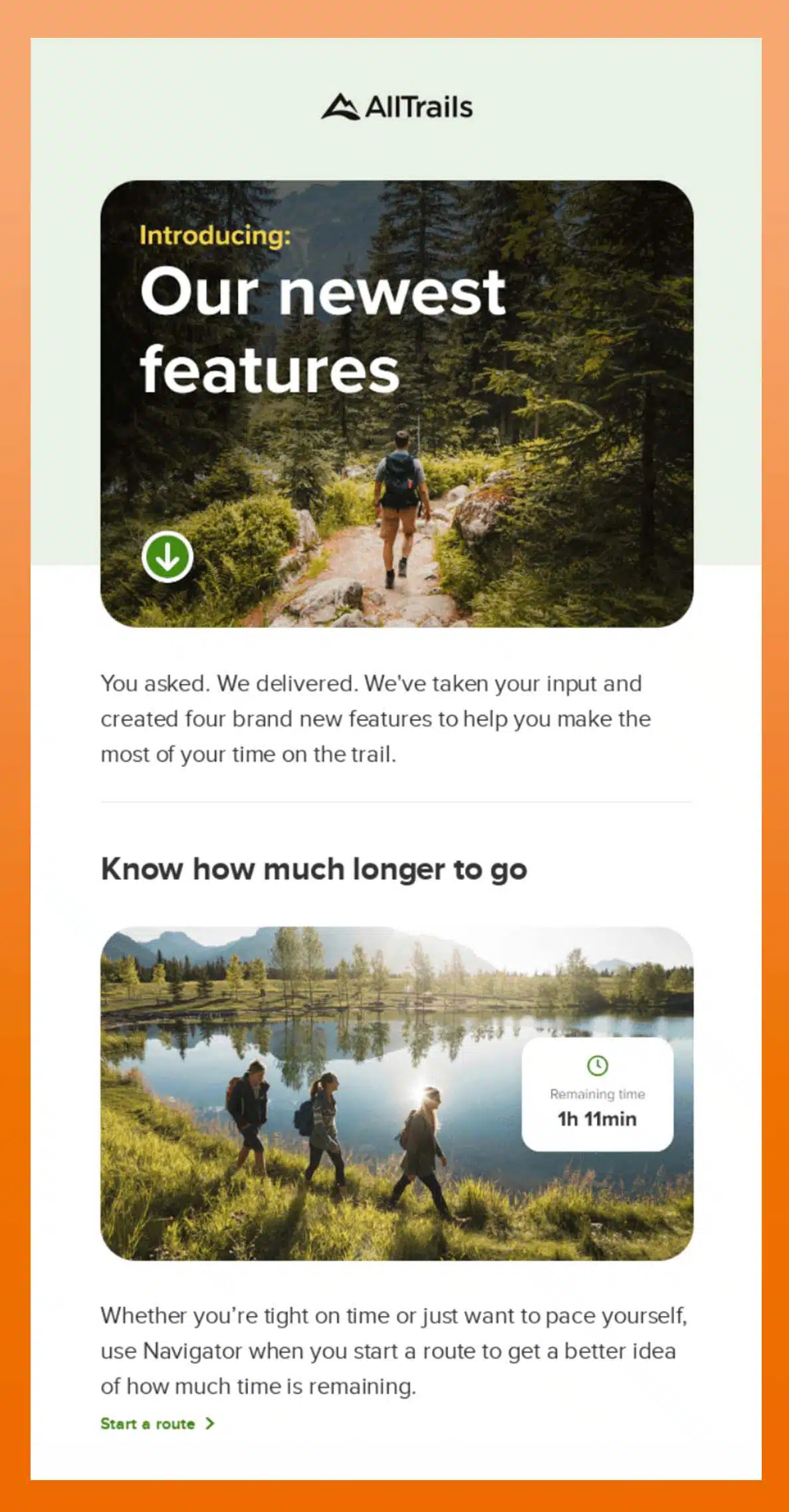
Color trends to catch the eye
Using bold colors is your best bet to create high-contrast colorscapes with striking accent colors. We’re not telling you which colors to choose, but here are a few we’ve found to be especially effective in drawing the recipients’ eyes:
- Neon shades (used sparingly)
- Gradients and color transitions, be it from one color to another or from one shade of the same color to another shade
- Bright yellow (used judiciously)
- Emerald/evergreen (used to frame images/text)

Can you meme it?
Memes catch the eye and have the potential to be hilarious and witty. Impress your customers, make them giggle, and you stand a much greater shot at being liked.
However, be wary of people’s sensibilities. Make sure that multiple teams see the memes and share their views before you send it off in an email.

More animated visuals and less text
Much has been said about low attention spans. Most people spend just about 8 seconds scanning the text rather than reading it fully. However, our brains still process visual content 600x faster than text. Images get our attention within seconds, hold it for longer, and tend to be more memorable.
So, dial down on the text; keep it breezy or tastefully curt. Win the game with the image.

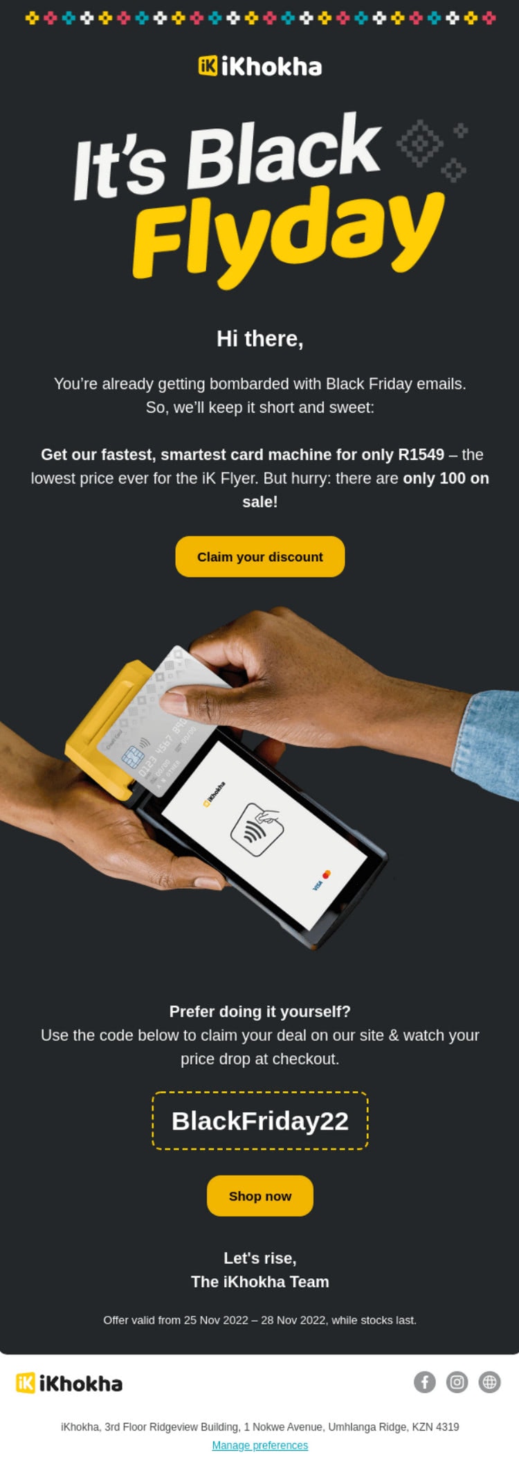
Don’t forget the dark mode
A sizeable chunk of your audience uses Dark Mode for its ability to reduce eye strain. Don’t forget to create email designs that are comfortable with Dark Mode and can take advantage of it from a design POV.
Quick tip, make very low use of text and stay away from pure black and lean fonts.
And so… Wrapping up
Here’s a quick reminder about the power of good design. Your audience is busy and has little attention to spare. But if the eyes are the gateway, good design is your magic carpet through the expanse of content.
With the right design, you can get your customers to relate to you and recall your brand quickly. You can get them curious, make them chuckle, or give them a nudge they can’t forget.
Over the last few decades, experts at Netcore have been obsessed with emails. We study, fuss over, research, and experiment with every industry, customer niche, and global context. We’ve designed and dispatched thousands of emails and our results show that they met their goals.
If you’re curious about how Netcore can make your emails look and do better, why not contact us for a demo? We’d be happy to show you how we can fit AMP emails into your marketing goals.
