The saying, “Seeing is believing,” holds true as much for email as it does for everything else around us.
Humans, being highly visual creatures, have a profound reaction to optical stimuli. This strong connection between visual appeal and emotions influences decision-making and can be skillfully utilized in your email marketing efforts. It’s not only the content of your email that matters but also the visual presentation that impacts conversion rates.
An aesthetically pleasing email is more likely to persuade users to click on the call-to-action, complete a form, or engage in any desired action.
In this article, we’ll take you through seven specific email design elements that significantly help increase conversion rates.
Bold, memorable colors
Nothing stays on the mind as well as the sudden impact of beautiful, bold colors. Why do you think brands invest so much into creating their signature colors and color palettes?
Use the color element to your advantage in marketing emails. Introduce a prominent, brand-aligned color to stand out from the usual white-body emails. Don’t pick a color just to shock your recipients’ eyes. Choose one that makes them positively associate the visual experience with your brand’s personality.
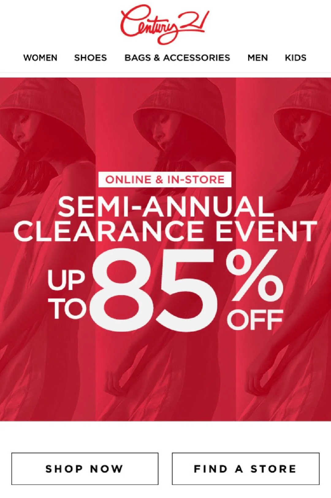
Century21 uses its brand color to grab attention, along with a simple but impossible-to-ignore text overlay. Sparkling wine red isn’t a color you forget; it’s powerful enough to be the matador’s muleta in the ring!
This email is no-nonsense and to the point. It has a message that’s likely to convince most users to click (who doesn’t love a discount?). But if it hadn’t been for that splash of vibrant color, many of these users would have just passed the email by.
White space is your friend
Here’s the cardinal law of creating digital content: Do-Not-Clutter-The-User’s-Screen. This is especially true of email. The reason? Several studies agree that 80% or more users check their emails on mobile devices rather than desktops.
You have very limited space to work with, so you have to be extra careful not to make your emails too ‘busy’ for the eyes. Remember to leave ample white space between your text and images.
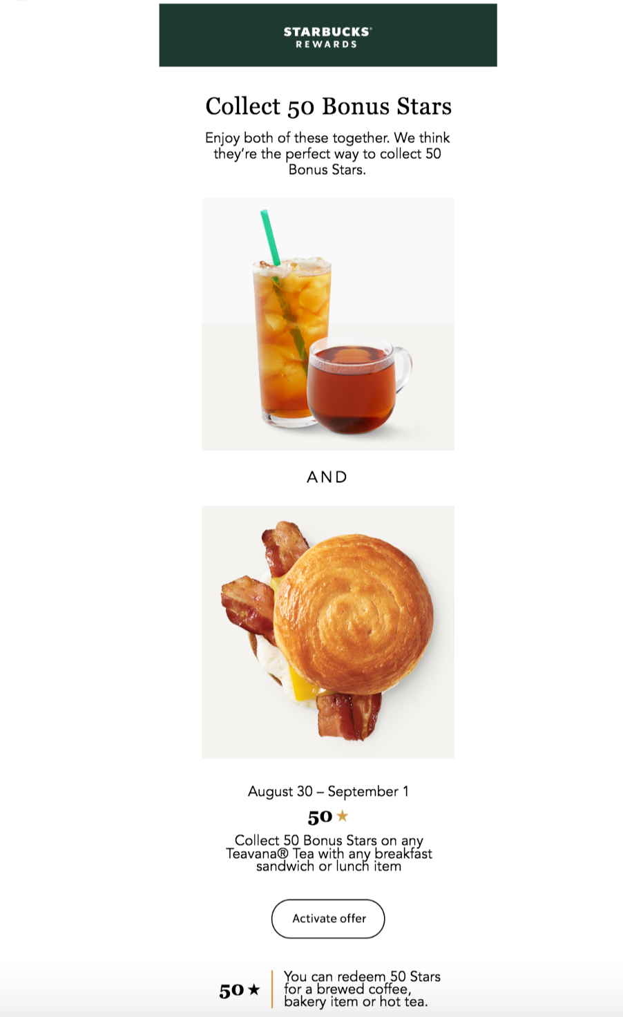
Starbucks conveys all the information they need to without sacrificing readability. Their clean, rounded-corners and classically effective design – along with the brand name – do wonders to grab and retain customer attention.
Large, visible, clickable CTAs
The intent of a marketing email (unless it’s an AMP email) is to get the user to click on the in-email CTA and visit a website page or form. To this end, it must be large, have easily legible colors, and be equipped with simple, direct text.
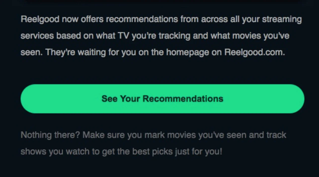
The CTA is large and it tells you exactly what you’ll get from clicking on it. The color also stands out but does not clash with the email’s native background.
User-friendly layout flows
Stack and shape your text and imagery in patterns that are known to facilitate easy reading and viewing. For example, a layout like the “inverted pyramid” and the “F-pattern” direct the users’ eyes in soothing, easy-to-consume movement, which makes for quick and easy reading.

Notice how the text is stacked in different sizes, ending with a CTA. You’re telling the user what information is essential and leading their eyes to the endpoint of the email with a simple difference in text size and weightage.
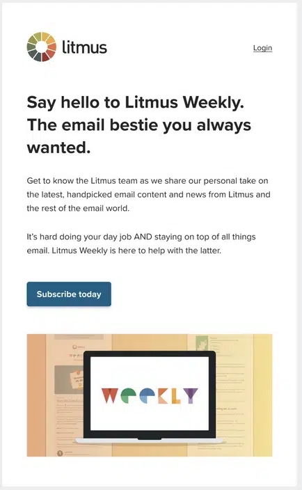
In this case, the F-pattern contributes to easy reading. While this email design lends itself to more formal atmospheres, it’s still a reliable layout people are used to seeing in their day-to-day lives. It’s a layout they are familiar with and likely to read through with the least resistance.
Either way, both emails draw the reader’s eye to the CTA, encouraging folks to click on it as a natural conclusion to reading the content.
Strategic text placement
Don’t bombard your readers with text; they don’t have the time or inclination to go through an essay. Balance your text with images so that users get a pleasant mix of something to look at and something to read.
Break up your text; no large paragraphs. Only focus on the highlights and place relevant text between images so folks get a break from reading as they look through the email. This way, users will actually remember the snippets of texts, retain what they say, and most probably act on those words.
Above all, invest in good copywriting. Smart, pithy copy is still a winner when engaging customers and skyrocketing conversions.
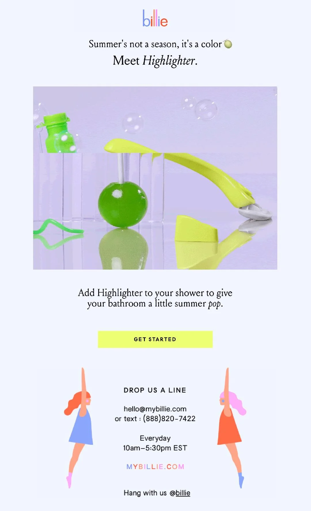
In keeping with the “summer” vibe, the body brand Billie keeps things simple and breezy. Balmy colors and pointed text give you only the information you need and nothing more. When paired with the quirky, livin’-carefree imagery, you’ve got a winner right there.
Actual directional signs
If you’re not feeling too sure about the layouts we’ve just discussed, and you want something that will directly help readers navigate the path, you can use actual directional cues to guide their eyes. This is something best reserved for emails with a crucial, sure-to-convert message – such as a sale announcement or a “stocks run out in 5 days” warning.

Chanel clearly got it right. Check out the quintessential grace in the layout. With a single image, the brand exudes luxury, draws your eyes to the CTA, and invites you to participate in an exclusive experience – that of being a buyer of Chanel. Absolute mastery.
Priority on mobile-friendliness
A report from Statista affirms that mobile internet traffic accounts for almost 60 percent of total web traffic. If your email doesn’t render well on mobile, it will inevitably be ignored without a single read.
Ensure that all your marketing emails are responsive. Optimize them for mobile screens of different sizes and resolutions. When it comes to the content, include optimal text breaks and a reasonably large font size.
You may consider using font sizes ranging from 14 to 16 points for the body text and 22 to 24 points for the headings. Send a test email to various mobile devices, including smartphones and tablets, to evaluate how your message will appear to the recipient.
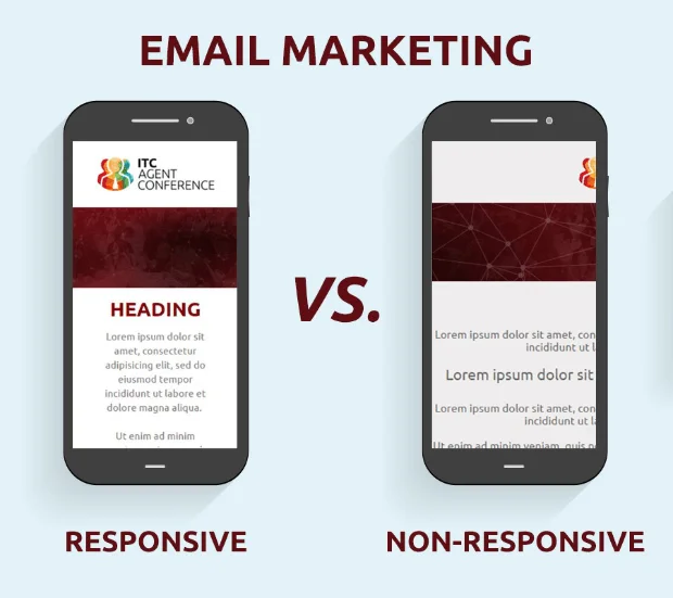
The difference between non-responsive and responsive emails is clear to the eye. One breaks when opened on mobile, and the other looks as if it was specifically created for the mobile.
The takeaway: Grab the eye, grab the heart
Once your customers develop an affinity for your emails, they will look forward to reading more of them. Using the ideal design elements means giving them more than just something pretty to look at. It means shaping the content so that users feel compelled to read through and click on the CTA.
Strategizing and crafting such visual experiences is not easy, especially when you are setting out to experiment with your email design. Email designs that miss the mark will only get you apathetic users, which is a terrible prospect.
So, why not let us help you get started?
Netcore has been recognized as “Ahead of the curve at applying AI to marketer workflow” in The Forrester Wave™: Email Marketing Service Providers Report 2022. For the second year in a row, we received the “Highest overall customer rating” as a Customers’ Choice, in the 2022 Gartner Peer Insights “Voice of the Customer” Report.
Most importantly, we send over 20 billion emails a month on behalf of 6500+ businesses across 40 countries – so we’re always analyzing results, carrying out optimization at different levels, and pushing for the highest possible goals in email ecosystems.


