


Contrary to what most people believe, user onboarding is not about:
- giving your first-time users a perfect list of to-dos to make them adopt your app
- teach them how to use the app, or
- dispensing as much information about your app as possible.
User onboarding is about how your product introduces users to the app and empowers them in their quest to solve a particular problem using a contextual onboarding experience.
Different apps solve different problems; this is why you will see several approaches to onboard users and create a good first impression.
Duolingo solves the problem of learning a new language.
Canva solves the problem by enabling anyone and everyone to design.
The user onboarding for these apps is the means to an end.
Table of Contents
What is user onboarding?
User onboarding is about the initial experience within the application. It is the process by which a new user is introduced to your app’s key features and value offerings.
5 reasons why a smooth onboarding flow is crucial
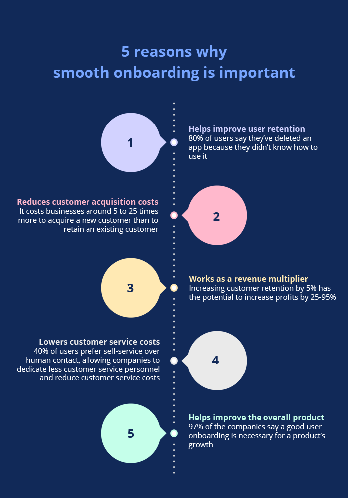
Users only delete an app if they don’t understand how it is resolving their problem and providing some anticipated benefit.
A superior onboarding experience helps you lower churn rates by taking the user from the ‘Peak of inflated expectations’ to ‘The slope of enlightenment and much beyond, to the extent that these users could become brand advocates.
Three stellar user onboarding examples and what we can learn from them
Example 1: Slack
Slack has one of the best user onboarding flows out there, and it is a personal favorite. It isn’t easy to be an entire industry’s go-to tool for team collaboration.
You might think Slack’s user onboarding experience is brilliant, but it’s also executed well.
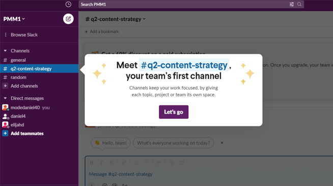
Slack starts with a frictionless sign-up and a crystal clear goal – to get new users to start using the product.
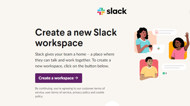
Source
In the main four onboarding screens, Slack only asks essential questions – the name of their team, the project they are working on, and the team members’ email addresses.
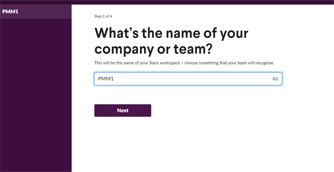
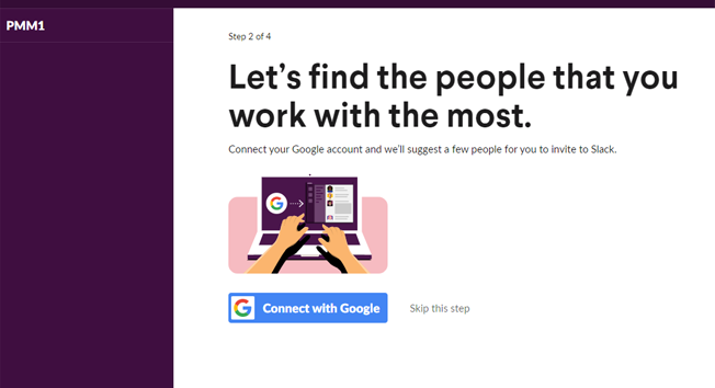
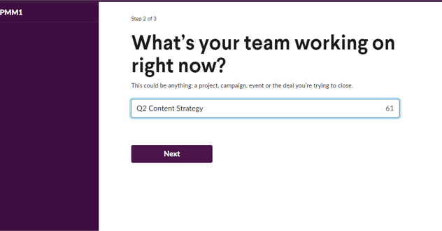
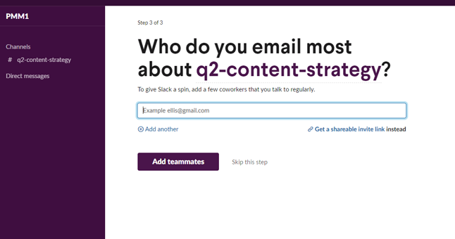
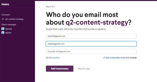
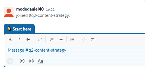
Source
That’s it. The new users are onboarded and ready to collaborate with their team on their next project in under 5 minutes – Swift onboarding is Slack’s core value.
Five things we like about Slack’s user onboarding approach:
- Articulates value prop & core functionality clearly and repeatedly.
- Less than 5 modal windows.
- Makes a new user interact with the product.
- Low time-to-value. Slack wants you to start using the product ASAP!!
- Use of contextual nudges to familiarize & encourage users with the app.
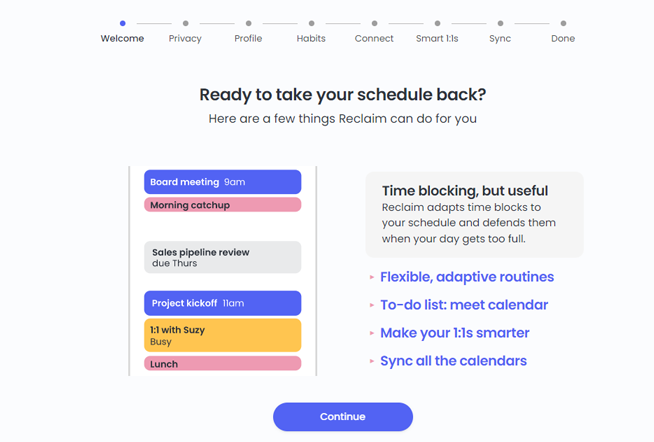
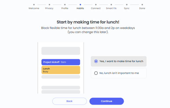
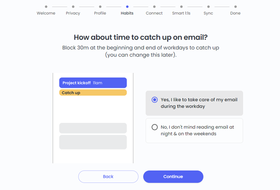
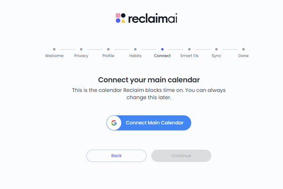
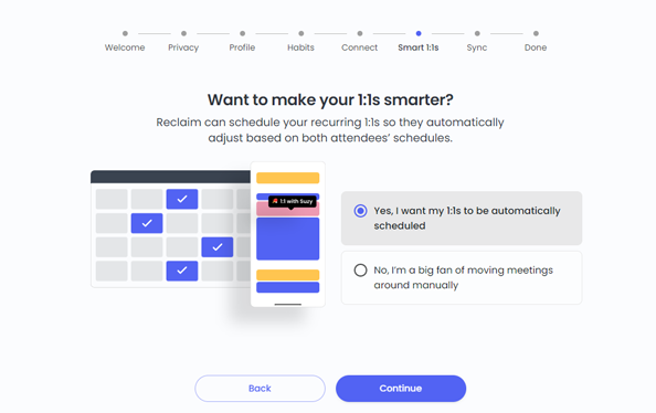
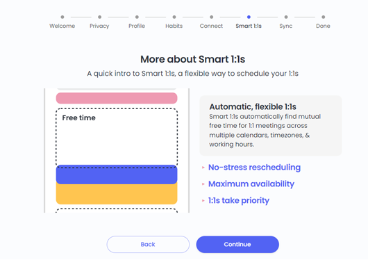
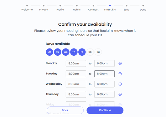
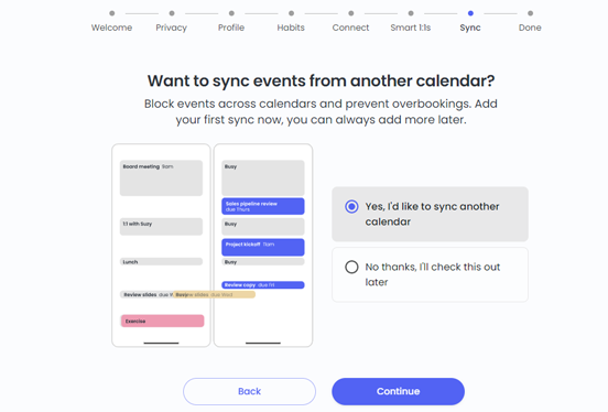
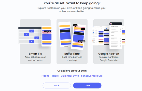
Example 2: Reclaim
Reclaim.ai is one of the smartest scheduling tools that automatically finds the best time for your tasks, recurring events, 1:1 meetings, and breaks.

Source
Five things we like about Reclaim.ai’s user onboarding approach:
- Uses an animated calendar for a glimpse of how Reclaim works
- Highlights the “aha moment” sooner by suggesting habits – an important product functionality
- Good use of empty states
- Offers an option of guided user onboarding flows for major features and the freedom to explore on your own
- Gets all the setup out of the way right in the onboarding process
Example 3: Salesflare
Salesflare is a powerful CRM tool with a well-thought and well-executed user onboarding experience.
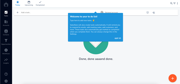
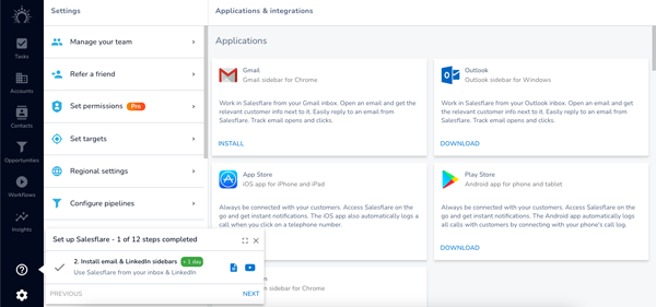
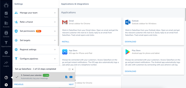
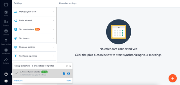
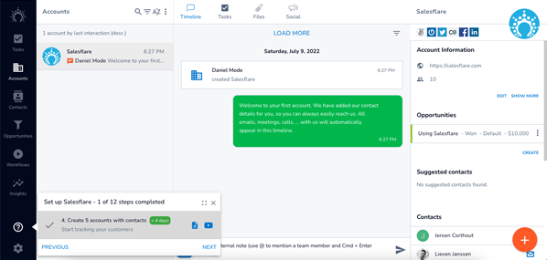
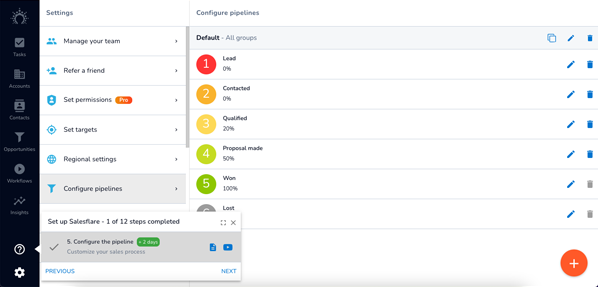
Five things we like about Salesflare’s user onboarding approach:
- An option to play around with the app using their interactive product tour.
- The “learning by doing” approach – new users finish tasks as they go along the user onboarding experience.
- A checklist with a progress bar – to ensure all the necessary steps are covered during onboarding.
- Use of digital nudges and empty states in the product walkthrough.
- The blend of proactive and reactive user onboarding strategies – for better user engagement.
Your checklist for delivering a great user onboarding experience
Find the “Aha” moment/Put a goal
A great user onboarding flow has a very specific goal. So, be clear about what you want your new users to get from the onboarding journey.
Do you want users to sign up? Or do you want to initiate a conversion right at the beginning? Or any other action you want your users to take at the end of the app onboarding journey.
And that’s not all.
You need to identify what a successful onboarding strategy would look like for each user and the problem each unique user is trying to solve by using your app. Based on that information, build an onboarding flow that is most relevant to those specific user segments.
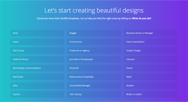
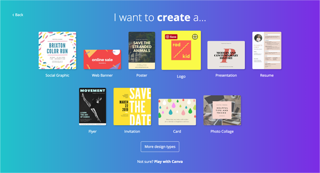
Canva, an online design tool, makes it easy for non-designers to start working on the app by asking what they are using it for (work/personal/education). A user who would select work would be shown a tailored user onboarding experience (like presentation templates) compared to someone using the app for personal reasons.
So, depending on the user persona and the specific purpose for which the app is used; you trigger a specific user journey – one that makes the FTUX (First-time user experience) much more seamless.
Source
Map user journeys
To create an ideal user onboarding flow, you need to understand the target users and their needs. You need to craft user personas that help you understand your users, their needs, and their goals. This will help you develop messages that resonate the best with them.
If you research your target users well, you’ll get the right insights to establish a flow that fits their journey.
A quick tip: Different personas mean different approaches. Tailoring the product onboarding to a persona’s specific needs will require you to test onboarding elements and their effectiveness.
Communicate your value prop clearly
To capture a user’s attention, you must make them understand what your product is all about. This calls for a compelling value proposition to be put in place – a statement on what makes your product unique.
A quick tip: Your value prop must be clear, concise, and quick to grasp the product’s core benefits.
In the image below, Notion’s value prop is very effective in what the app can do for its new users.
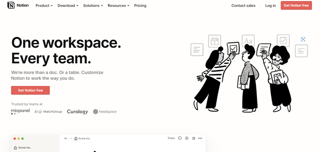
Source
Introduce core features
Most brands falter when they show every feature (even those that may not be remotely relevant to the user) during the onboarding journey.
The cognitive overload from introducing too many features at one go overwhelms new users and leaves them utterly confused about what features to explore or what to click on next. This becomes a major friction point where the user’s intent to uninstall the app is highest.
A quick tip: The onboarding journey should focus on introducing only those critical features for new users to get started and work their way through the app seamlessly. Ensure your users meet with the activation event quickly through a steep learning curve. Avoid a meandering learning curve. Use a swift learning curve instead.
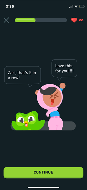
Success states
Guiding new users through a complicated flow of actions is a process. It is a continuous conversation between the user and product that includes telling them when they’re doing something right. These are called success states.
Success states are an opportunity to keep encouraging users. Keep telling them they’re doing great. Keep acknowledging their progress. Constantly celebrate each of their success with them.
When you inject these success states correctly, you unobtrusively engage new users to complete their onboarding journey. You also improve customer satisfaction.
A quick tip: Learn from Duolingo. During their onboarding, they skillfully keep their users on track by celebrating little wins along the way.
Offer an option to “Skip”
Not every user wants handholding them throughout the onboarding journey.
To remove any friction from your onboarding process, allow new users to skip or delay screens if they want. If there are more than 4 screens in your onboarding that the user has to click through, a skip button is preferable. It provides them with the opportunity to manage their onboarding flow.
A quick tip: Design a skippable onboarding experience to test completion rates against the non-skippable flow. This kind of experiment can help you in perfecting your user onboarding flow.
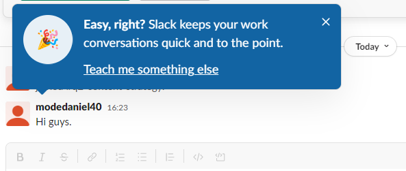
Reclaim.ai suggests users invite others for a 1:1 with them. In addition to suggesting this, it also allows new users to skip this step for the time being.
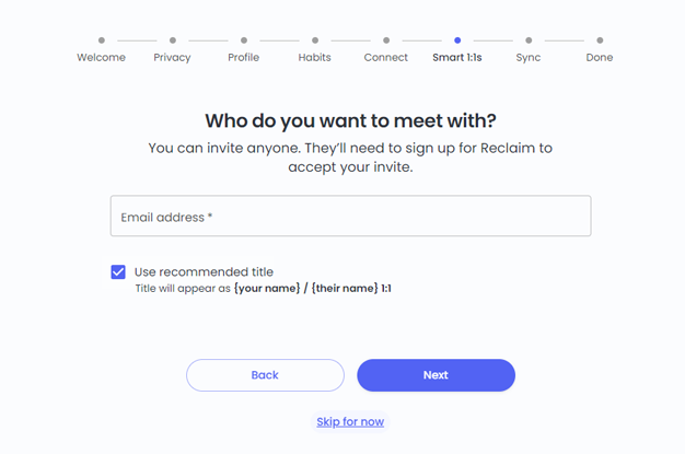
Source
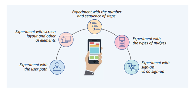
Use A/B tests
You can conduct experiments for
- the number of steps involved in the onboarding process
- the sequence of the steps
- the types of nudges
- information revealed to new users
- tutorial vs. no tutorials
- UI designs
- Sign-up form or no signup form, depending upon the purpose of your app and all the other important aspects surrounding the onboarding process.
Avoid these user onboarding mistakes
Long, upfront static tutorials
In the game of bowling, you need to roll the ball in a straight line to hit the bullseye (strike-out) – something you can apply to the onboarding process. One of the most important parts of this framework is straight-line onboarding. Straight-line onboarding contains the absolute minimum number of required steps for a user to experience value.
Ask yourself, what are the critical steps in the signup process? Which are the ones you can eliminate? Which of them can be delayed and shown at a later stage as users explore the app? Identify the straight line of your app. It’s crucial for a compelling user onboarding experience.
Don’t bombard new users with coach marks
A common onboarding approach for many apps in the market is to use tooltips and blurbs with a dark overlay called – coach marks.
Coach marks are temporary messages that are meant to educate and guide users through new or unfamiliar product features. Multiple coach marks are often linked into a sequence to form a walkthrough/product tour.
But in most onboarding flows, most new users skip through coach marks, not finding them useful. Your users do not get on your app to read a bunch of instructions.
When you present these instructions as a set of coach marks or a screen is filled with them, it creates a cognitive load on the user – forcing them to remember and apply each of these steps. There’s a high probability that your users will not retain this information.
So instead of presenting a bunch of coach marks at once, try being more intuitive. Try using contextual nudge journeys. Identify the right moment and inject a nudge in that instant to guide your users in the right direction. Adopt coach marks to create a more personalized onboarding flow.
An example of bad use of coach marks –
Source
Creating dead-end pages
Many apps show a blank screen for new users since they haven’t taken any action on the app. These app screens require users to perform actions that would reflect some content on these blank screens –
You can use empty states to guide and educate users to take action. Leaving users with some information on these empty states encourages them to take action and further engage with the app.
You must go beyond simply stating what and why these empty states are on the app. Users need a clear direction on the steps they need to take to fill it. Ideally, these empty states are the starting point for users to engage in critical app activities.
Like every UI/UX element, empty states need to be designed to delight users right from their first interaction.
Don’t ask too many questions
Think like a user. Would you sign up for an app that asks you to fill 10 fields in the first interaction? I wouldn’t !
An app launch does not indicate prospects being convinced about your app’s value.
They’re interested, sure, but certainly not bought in yet. So, to help prospects cross the chasm from first-time to lifetime users, it’s critical to eliminate the roadblocks on this path, a complex sign-up being one of them.
For instance, a multi-channel verification process doesn’t count as a very pleasant experience.
Another onboarding killer is apps asking for your card details. Yes, they might not be charging you initially, but even in a free trial version, asking for card details might not be the smart thing to do. Users don’t want to commit to the app at such an early stage when they’re still evaluating the app’s value.
You need to identify all those pitfalls where a user could drop off and stick to asking only for those necessary bits of information for users to use the app successfully. This will help you improve the overall product adoption.
So, give your users a chance to experience the product before asking too much. Make the onboarding experience friction-free.
Best practices for user onboarding process
Adopt a “learn by doing” approach
The “learn by doing” approach is effective at the right time, and that right time for any mobile app is the onboarding process.
But make sure you don’t overwhelm your users. Start with small tasks that give your users an overview of how your app helps them. Build on these small actions to help them easily understand and get acquainted with them.
Showcase your app’s personality
You must follow the same tone and visual design across your product to create an onboarding flow with the same personality as its app.
Users are quick to form judgments when they first launch your app. Take this opportunity to introduce your users to your app’s personality immediately. Put efforts into the copy and visual components of your app’s onboarding flow.
Focus on benefits instead of features
Users don’t care about your app’s features as much as you do. They only care about how your product will make their life easier.
You must understand that the users will only give the time and effort to learn your entire product once they have experienced its value first-hand.
The goal of user onboarding should be to demonstrate that value, not shine a spotlight on every detail of your product.
So don’t drag your users across screens trying to show off features.
Instead, identify the features and actions users need to be familiar with to reach their aha moment. Focus your onboarding flow around these benefits. Understand user behaviour and see how you can adapt it to make product adoption easier.
Once this realization hits your users, you can later run feature discovery and product adoption campaigns.
Place Contextual nudges at critical steps
Contextually placing nudges and walkthroughs help users navigate the app’s critical steps. Nudges guide users to the desired value without interfering with the overall users’ flow and experience throughout the onboarding journey.
Product tours in a series of tooltips work exceptionally well in walking users through the key app features and benefits and improving product engagement.
Spotlights are extremely effective in grabbing a user’s attention to introduce critical features to the app.
The right combination of nudges targeted at different user cohorts helps draft unique onboarding experiences, increase activation, and ensure a frictionless onboarding experience. Customer favorite brands like Google, Slack, Dropbox, and many more have leveraged nudges successfully across their apps to engage and retain users on Day 0 and beyond.
Here’s how Dropbox crafts its onboarding experience for first-time users. Depending upon the set of actions/what the user clicks on, a series of nudges are triggered to introduce relevant features to the user’s context.
And, deploying nudges and walkthrough is as easy as it reads. With the ongoing low-code/no-code revolution, you can implement these nudges without writing a single line of code and having zero dependencies on developers. Product Managers can now fully orchestrate their app user’s onboarding journey to ace the metrics that matter the most.
Use Progress bars
A better understanding of the user psychology behind decision-making is important in creating powerful onboarding experiences that make users stick to your app.
The goal gradient effect – one of those many psychological hacks suggests that the more the users see their progress towards a goal, the more they’re determined to finish off the tasks.
Progress bars and checklists leverage this user tendency to drive them towards onboarding completion. When users know exactly what to expect, they’re more likely to complete the tasks.
Yet again, Duolingo sets an amazing example for this.
To know more about how behavioral science plays a major role in onboarding, here’s a blog piece for you: Behavioral Science: 5 principles to improve your app onboarding experiences – Netcore
Measure and iterate
Every tap, swipe, and time spent on the screen gives you insight into the experience you are providing with your user onboarding flow.
With any friction that your users face, there’s a high probability that they will abandon the app.
While traditional, quantitative analytics offers us numerical data, they do not provide an insight on whether the elements on your user onboarding flow are faring well or not.
Mobile app heatmaps are a visual overlay that represents the average user activity. These heatmaps include an array of colors to represent user interactions. That allows you to see what elements get the most attention and what gets ignored.
These insights help you look at the app elements from a user’s perspective.
Tracking and analyzing app patterns help you come up with iterations that:
- reduce friction
- reduce time-to-value, and
- are closer to what they expect out of your app.
Final thoughts
Product-led growth approach is a common theme that bleeds into all these best practices. Every point in this checklist breathes long-term app growth with the product taking the front seat and keeps the product experience at the heart of every strategy, bringing a product-led growth strategy into action.
Onboarding is undisputedly the first and most important step in implementing a product-led strategy. If these are already on your onboarding checklist (if not, you need to prioritize them now), you’re on a great start to leading a product-led strategy for your app.
And while you’re at it, Netcore’s Product Experience platform can help you build amazing onboarding experiences with zero development and engineering efforts.
Deploying no-code contextual nudges and walkthroughs from Day 0 creates a seamless experience for first-time users, navigates them through critical app features, drives faster user activation, and helps users realize the app’s core value right at the start.
