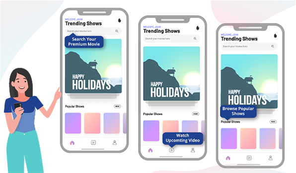
Did you know that 80% of users uninstall apps because they can’t figure out how to use them? The functionality of your app is crucial but demonstrating your app’s value to users is the headstart you need to stay ahead of the competition and keep users retained.
Enter: Contextual app walkthroughs – one of the most potent tools for user onboarding, faster activations, better feature and product adoption.
App walkthroughs reduce feature complexities to bite-sized information/instructions with sequential nudges. Offering users guidance based on user-specific goals helps them navigate the app smoothly, take step-by-step actions and reach the ‘aha moment’ faster.
But if done wrong, walkthroughs can feel like a burden and make users feel lost on the app. And that’s why you must be vigilant about how you lay it all out for your users. Let us now look at some guiding principles for building great app walkthroughs, especially without putting in any coding efforts.
A contextual app walkthrough comprising multiple nudges helps users transition smoothly through the app by making them proactive during the onboarding process without interrupting them.
Guiding principles for creating an app walkthrough
Walkthroughs must be tailored to match the level of expertise a user has with an app. If it’s too long, you might miss out on users who have been using the app for a while. On the other hand, a short or ineffective walkthrough can confuse new users. Alternatively, too much hand-holding, sans quality engagement, could simply push a user to press the exit button.
To avoid all this, here are a few things you must keep in mind to set up an effective and contextual walkthrough for each of your app users.
Clarity: On how the feature works
Brevity: Don’t give away too much. The information must be just enough for users to realize the value and get started.
Engaging: Let users interact and complete key actions themselves
Non-Intrusive: Subtly placed nudges that don’t interrupt the user’s flow on the app
Helpful: Offer additional information as and when users need it
Below, we will go through 4 tactics to make your app walkthroughs simple, engaging, interactive and effective.
App walkthrough tactics for your B2C mobile app
1. Implement a sequence of contextual nudges
A nudge is a customizable in-app navigator (or visual cue)that enables users to take actions or the next best step. The idea is to help users quickly get to the activation point. Let’s take the example of an e-commerce app. A sequence of nudges could encourage users to complete key activation actions like – setting up profile (address, payment methods and others), browsing products, add to wishlist/cart. All of which would lead to the final conversion point – the ultimate goal.
Along the way, you can also introduce key app features by using a sequence of nudges like spotlights or tool-tips that are non-intrusive, eye-catching, and deliver just the right message to users.
2. Gamified walkthroughs to engage users
Gamification has several aspects, such as levelling up, reward points, and comparing user performance on a leaderboard.
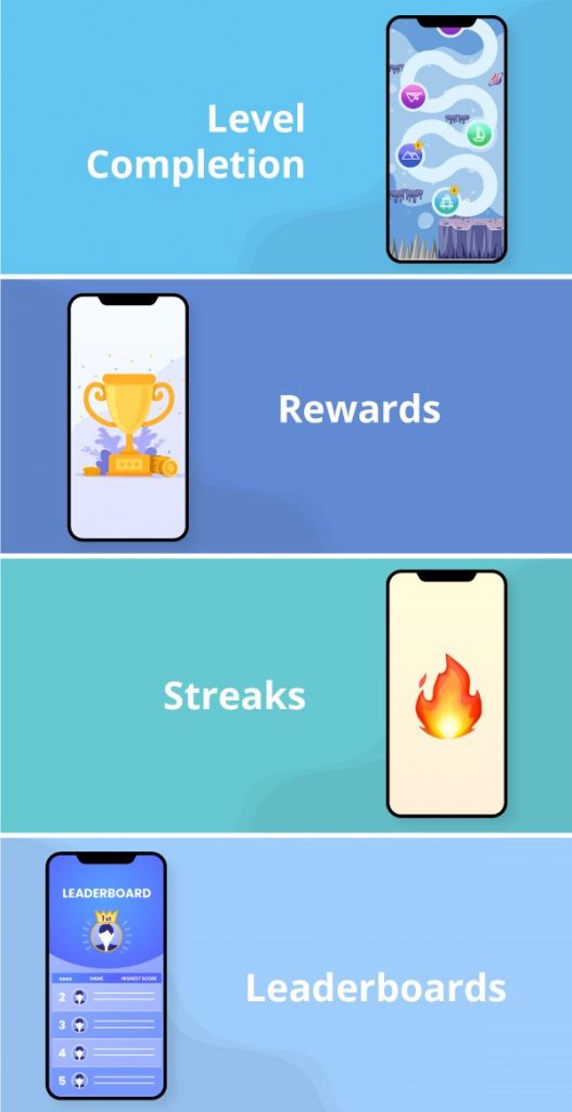
Gamification can work wonders for walkthroughs. It provides positive reinforcement and increases product stickiness. Over time, it improves engagement rates and reduces app uninstalls. End result: You-1 Churn-0!
The whole concept of gamification exists because of gaming apps that use these techniques to keep users hooked. Think about Candy Crush Saga or even Farmville. Do you remember a single day when you didn’t end up logging in to the app? These apps successfully created habit loops that lead users to keep coming back to it.
Game-like engagement within the app helps improve the overall user experience. T. By rewarding users continuously, you will keep them hooked on the app. Give away some in-game prizes or upgrades, or add them to a leaderboard! The sense of progress is what ties users to your app.
Look at this – Users of a fitness app generally set some goals for themselves in terms of weight loss, weight gain or higher activity levels. Ideally, a user would need to complete specific actions daily like logging in food calories, water intake, exercise, and even their daily weights to achieve these goals. Gamification comes to the rescue to ensure that users perform these activities every day. Maintaining users streaks (communications like you’ve logged in 5th time in a row) or assigning reward points to users for every kg lost act as a source of motivation for users to continue the habit. And using nudges to highlight these achievements is one of the most effective gamification techniques.
3. Keep it interactive
Interactive walkthroughs are quintessential criteria of an engaging walkthrough. Sounds quite obvious, doesn’t it? But here’s the thing – most times, walkthroughs are product tours in disguise. They end up overburdening users with information that users can barely retain or recall. The result? Users end up confused when they actually start using the app. So instead of simply showing users the app features, interactive walkthroughs get users to interact more with the app. The more the interaction, the faster users reach the activation point. Engagement is a two-way street. Experiencing the app while performing actions equips users with the proper knowledge of the app or a new feature exactly works.
Using nudges helps draw your target user segments to adopt existing and new features quickly.
Consider the Dropbox example. Dropbox encourages users to take action during the walkthrough process itself. For instance, Dropbox nudges users to create PDFs and upload photos during the walkthrough.
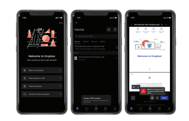
This way, the app gets the user up and running with what they want to do in no time at all, increasing the possibility of greater engagement rates and better ratings in the app stores.
4. Allow users to set their own goals
Apps like Pinterest, Calm, and Headspace use specific predefined goals to make it easier for users to set their objectives.
Let’s consider the case of Calm. It offers seven predefined goals that a user can pick from. The entire user journey is based on the personalized goals set by users.
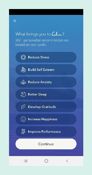
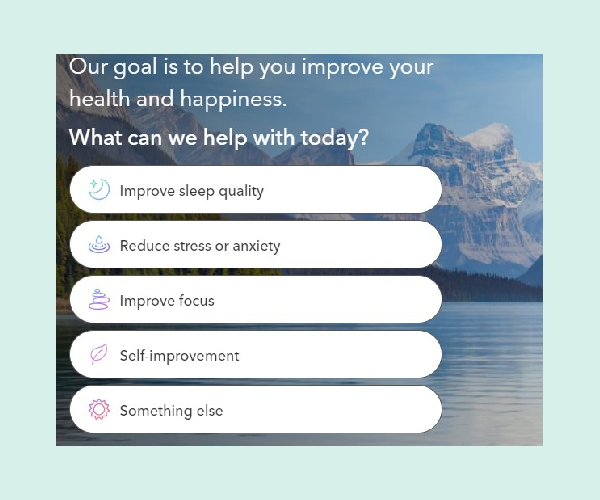
In just a few clicks, users can move towards achieving their meditation goals. And this is the experience that every user is looking for. With goal setting, walkthroughs become much more personalized. When you highlight the next steps to users based on what they want to achieve on the app, it reduces the choice overload for users. Consider this – a telecom app solves this problem by recommending recharge packs based on the latest recharge. Another example could be a fitness app that makes daily recommendations for lunch. It could just highlight healthy recipes native to the customer’s location. The user does not drop off due to choice overload in either case, as the app prompts the following best action to the users.
Implementing no-code walkthroughs with Netcore
Cleverly crafted contextual walkthroughs successfully engage and retain users. They are a quick way to help users discover vital features and drive product adoption by guiding users on the way around the app. On the other hand, lengthy random walkthroughs give users a tough time on the app and increase app churn.
Walkthroughs may seem like a tedious development task. But not anymore!
Netcore does away with these challenges effortlessly, getting you up and running in just 15 minutes. Our No-code Product Experience module helps trigger personalized walkthroughs (using a series of contextual nudges like tool-tips, beacon, spotlight, coach mark & more) without any coding efforts. You can create simple drag and drop unique walkthrough journeys for every user segment with absolutely no-code. Talk to us to know more about creating app walkthroughs the no-code way.


