


Nearly 80% of customers delete an app in a 3-month window because they cannot fully understand how it works. How do you get around this? Of course, you want to make your app easy to use, deliver quick value and create a rather seamless app experience for your users. If you are donning your thinking (right message to the right user at the right time) cap now, you must think, what’s the big deal here? In-app messaging can do the trick. Well, in reality, in-app messaging does have a flipside to it. There are several reasons why they may fail to be an effective engagement strategy.
Let’s deconstruct those reasons for you and discuss why nudges are coming up as a better way of delivering personalized and contextual messages to users at the right time.
Understanding in-app messaging
In-app messaging comes in the form of banner style notifications or huge pop-ups that appear on your app screen, making a new announcement, introducing a new feature, or highlighting introductory sign-ups.
What are nudges?
Nudging is the process of communicating with users to appeal to the psychology of the individual and further promotes the desired user behaviour.
In the app space, we define nudge as a subtle visual cue highlighting a specific option (over others) that prompts users to take action. It’s designed in a way that does not interfere or disrupt the user flow. Meanwhile, they also make it easier for users to decide by reducing the choice overload.
In fact, the whole concept of nudges is based on the very fact that humans, in general, are very resistant to changes and avoid taking decisions. When surrounded by many choices, they tend to choose the prominent one (or the highlighted one).
In-app messaging vs nudges: Which is the real driver of user experience?
You want to conduct a product tour, announce new features, manage customer feedback, or drive the customer to take favourable actions, and to drive all these, one of the most apparent tools you would pick would be in-app messaging.
It may even seem redundant to think of any other way to communicate with users within the app. But what if there was a better and more effective tool to communicate? Think contextual nudges. They have the power to take user experience a notch higher when compared to in-app messaging. Let’s dive in to understand how they are better.
1. Non-intrusive app experience with nudges
In-app messages tend to impede a user’s flow on the app. The flashy pop-ups block the app screen and, at times, force users to take action even when they do not want to. This, in turn, increases the chances of the users not just dropping off but also eventually uninstalling the app.
On the other hand, nudges take a more subtle approach to gaining and retaining users’ attention. A nudge is a gentle push to take the next step without creating a sense of over-urgency on them. Users can continue to perform actions on the app even when the nudges are displayed.
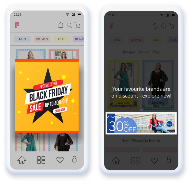
Let us look at an example. In most popular e-commerce apps, there would be featured deals that you want to highlight to users. Yes, we could do it with an in-app message: a banner or a pop-up flashing the ongoing discounts. Or you could trigger a simple nudge to the user segment that has frequently purchased products from a specific brand. A subtle tool-tip on that particular brand on discount feels much more personalized and much less intrusive.
Can you imagine anything else quite like a nudge to delight customers and get them to take action without forcing them to do so?
2. Better onboarding with nudges as compared to in-app messaging
Who doesn’t love a grand welcome! Onboarding is an integral part of the user journey, perhaps the most important. The onboarding process is the first step to familiarize users with an app. A successful onboarding focuses on the end-users goal rather than what you want to show to your users.
Progressive onboarding journeys work well – letting users experience the app themselves and offering guidance as and when users need it.
Again there are two options when it comes to creating an onboarding process. You can rely on in-app messaging or nudges.
Creating an app walkthrough using in-app messaging is not recommended as it makes the onboarding process a journey they sometimes do not wish to take. One message after the other pops up, and the user has no go but to act on them. The users have little control over what’s happening, may lose focus, and even miss features introduced during the onboarding process that would be critical in using the app further. On the other hand, nudges can be contextually sequenced to highlight/introduce only relevant features to the users.
For instance, Headspace allows users to log in directly with other social accounts such as Google, Apple and Microsoft. Once the user has signed in, a simple carousel highlights what the app is about and benefits the user in three slides. Users need to pick one goal and get started on the app journey as the next step. For instance, if you select “Sleeping Better” as the goal, then it will display “Put your mind to bed with original sleepcasts, music, and relaxing sounds”. The app tells a story, and users love it for that! And the best part is that while telling the story, it does not force you to read it thoroughly. But it’s, of course, there should you want to read it. This is what makes nudges so much better than in-app messaging. Implementing in-app messages is likely to disturb the app’s user flow, making them less motivated to continue using the app.
Overall, user experience depends greatly on what you do beyond app design and layouts. It’s all about helping users meet their goals/needs using the app, and that’s precisely what nudges bring to the table.
3. Nudges are more versatile and UI friendly
Are you introducing a new feature/upgraded feature to a user? A feature announcement in the form of an in-app message, which covers almost the entire app screen, seems quite overboard, doesn’t it? A nudge can be tied to a specific element, making it more appealing and relevant.
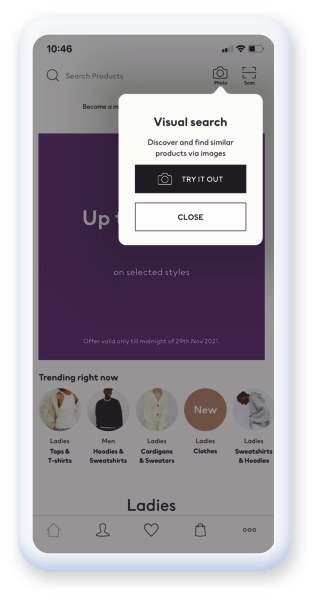
The images below show tool-tip nudges in action. H&M deploys a tool-tip on their visual search feature when the user is at the homepage. This helps users find products easily – preventing them from dropping off and driving feature discovery and adoption.
Both forms of communication try to get the user’s attention to an existing feature. The difference is that a simple nudge makes the user experience much more pleasant by providing a “context” to the new feature itself. Here’s a simple use case for an online streaming app – nudging users towards the ‘add to playlist’ feature. Guiding users to manage their favourite songs better while listening to music is a great way to introduce key features and get users to utilize them.
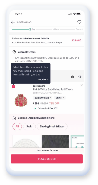
The fact that a variety of nudges can be used (including spotlight, tool-tip, coach marks), each of them solving a specific use case, is also remarkable. The coach mark tool, for instance, can be used to highlight a less used feature on the app, such as changing the preferred language on a music app. The tool-tip can be used to provide more information on what to do next. For instance, a tool-tip for a password field might inform the user before he even begins to type what conditions the password must satisfy, such as being alphanumeric, using at least one symbol and a capitalized letter and so forth.
Variations with in-app messages are very much limited. There are not many changes you can make in terms of placement and the types of in-app messages used. The variety of nudges available allows a lot of scopes to experiment with different types of nudges. There’s a whole library of nudges to choose from. When it comes to in-app messaging, it’s just a wall of text and a few emojis at best, and it is not the most intuitive or captivating channel for communication.
The importance of UI in the entire user experience is quite significant. With multiple designs and types – nudges add a unique touch to the whole app user experience. This is something that in-app messaging may not always do for you.
4. Latency and internet connectivity needs
In-App messages are triggered by server-to-server interaction leading to latency. All evaluations are done right on the device and not on the server for nudges, resulting in absolutely zero latency. Nudges are delivered to the user on time when the user’s intent is the highest, enhancing the overall user experience by offering the right value at the right moment.
User context can change within seconds or in-between screens, and a zero-latency solution is exactly what you need. Netcore comes to the rescue, ensuring that nudges are delivered to the right user at the right time, without any delay. Pop-ups and other in-app messaging will still require an S2S connection to display. It seems like a landslide victory to the nudge over the in-app messaging.
What’s the verdict?
All of the above pointers suggest that nudges are clearly the choice instead of in-app messaging. If you wish to go beyond promises and architect a rich customer experience, you must monetise on the power of nudges. The cherry on the top: You can implement nudges without writing a single line of code. You can create flowchart-based nudge journeys and implement them in less than 15 minutes. Exciting, isn’t it? To know more, Book a personalized demo with us!
