


The COVID-19 pandemic of 2020 has put the spotlight firmly on online business growth like never before. What was earlier a choice or luxury of selling or buying online has now become a necessity to survive and thrive in these unprecedented times.
Marketers and Product Managers over the years have gathered great expertise in making their products stand out with exceptional marketing and advertising campaigns to achieve their business goals. But, with the recent surge in digital users, some of whom are new acquisitions; there arises a dire need to understand them. It is their needs, expectations, and behaviors that influence future demand.
We all know that every user who uses your platform is unique thus making customer data the foundational powerhouse for both Marketers and Product Managers. Enrich your customer data by collecting data like, who are these users, what are they doing, where are they struggling, where are they dropping off on my platform, and many more such crucial data points.
It then becomes important to understand how well you utilize this powerhouse of rich, relevant, and real-time data to charge your efforts and achieve your business goals.
To get the best out of these customers, I would recommend using the “The Bowling Alley Framework” which has worked exceptionally well for me every time I have used it.
What is “The Bowling Alley Framework”?
Wes Bush, in his book “Product-Led Growth”, outlines this effective framework. Let me break it down in simpler terms for you.

Take a walk down memory lane to any time when you may have witnessed or gone Bowling, first-hand. There are 9 pins stacked in a triangular shape at one side of the lane and on the other side, it’s you with a heavy Bowling ball approximately 9 -11 inches in diameter.
Your goal is to simply roll the ball down the well oiled wooden lane (I always refer to this as the Awesome UI and UX) and knock down the maximum number of pins that you can. In the game, you approximately get 9 rounds with 18 attempts to score the maximum points. But, in reality, you only get a maximum of 3 – 4 attempts to make the most impact on your customers (take my word for it!).
Now comes the difficult part – of how to miss those gutters on both sides of the lane. Every time your Bowling ball goes into the gutter you don’t score any points. Thanks to Phil Kinzer, we now have a solution. He introduced a new form of Bowling called Bumper Bowling where bumpers are placed at the edges of the lane, ensuring the ball continues to remain within the lane and out of the gutters. An ingenious aid, don’t you think?
Similarly, as a digital business, you need to implement a ‘Bumper Bowling’ strategy to ensure your customers aren’t distracted during their journey and ensure that they perform a conversion activity that is in line with your business goals. The beauty of this framework is that it would work irrespective of your platform – B2B or B2C.
So what are the key elements required to implement a foolproof ‘Bumper Bowling’ strategy?
Let’s take a look:
- Straight Line Path
- Product Bumper
- Conversation Bumper
- Straight Line Path
Let’s understand what a Straight Line Path is.
You know who your online customers are and why they are using your platform – from all the data that you have collected. If you still don’t know this or you have multiple features and don’t have clarity on why a particular customer is there – just ask him/her!
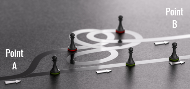
Be straightforward and ask the customer why he/she would want to use your platform and then based on the response, plot a straight line which would be the shortest path for him to achieve his goal.
The sooner a customer achieves his goal, the more he/she will appreciate your offering.
Task 1 is done. Now you can deploy strategies around how you can introduce more features that you offer, one by one, and increase their stickiness.
Let’s explain this with an example here: The biggest franchise-based T20 cricketing extravaganza – the Indian Premier League (IPL) is currently underway. And, you happen to be a Fantasy Sports app where users can create their Virtual Team before the match and win prizes based on their selection. The Straight Line Path, in this case, is very clear: to create a team and participate in one match.
Now ensure that for your users to achieve this goal it becomes easy and seamless. Just go through all the steps that you have in place and start marking them as Mandatory and Non-Mandatory.
Example:
- Signing in or creating an account – Non-Mandatory
- But can I ask the user to do this, once he has achieved his first goal ?- Yes, most certainly!
- Upload your picture or connect your social profile – Non-Mandatory
- Consider this: Will the user even do this, if he/she isn’t going to stick around? – Definitely not!
- Define your team name – Non-Mandatory
- Don’t take too much of your users’ time, make it quick. Apply a default Guest Id, let him/her change it if required
- Select your players – Mandatory
- Join a contest – Mandatory
A simple example of how a 5-step user journey can be reduced to a 2-step journey – that is if you only know what your Straight Line Path is.
Once the user has done this, you can strategically introduce your features at appropriate points and engage him/her effectively to improve app stickiness and customer loyalty.
Now comes the strategic 2nd step.
2. Product Bumpers
In simple terms, Product Bumpers are hacks that you can deploy to increase adoption when the user is on your platform.
Here are a few that can be used effectively:
- Product Tours
- Progress Bars
- Tooltips
- Empty States
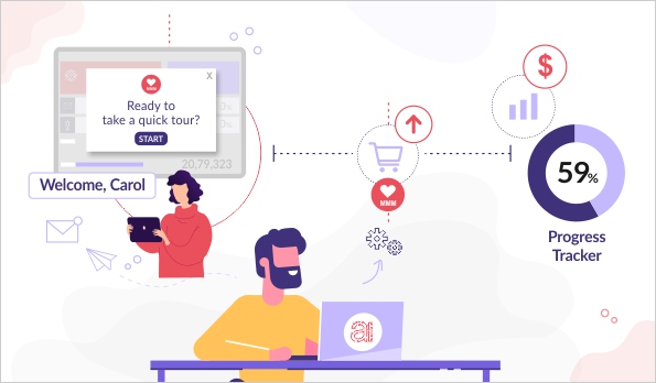
Product Tours

Product Tours are the most effective manner in which you can very quickly demonstrate to the user how easily they can achieve their goal. It is most handy in scenarios where you have a complex product and it requires some level of hand-holding to get the user started on his/her conversion journey.
Keep this as simple and short as possible, just highlighting the steps required to achieve the goal in the Straight Line Path that we defined earlier.
You can have multiple Product Tours. Depending on why the user is using your platform, showcase the most relevant ones to them; instead of bundling all your capabilities as part of the product tour.
Progress Bars

These are our favorites. One of my colleagues recently implemented this on our platform and it has been working wonders for us, in terms of feature adoption.
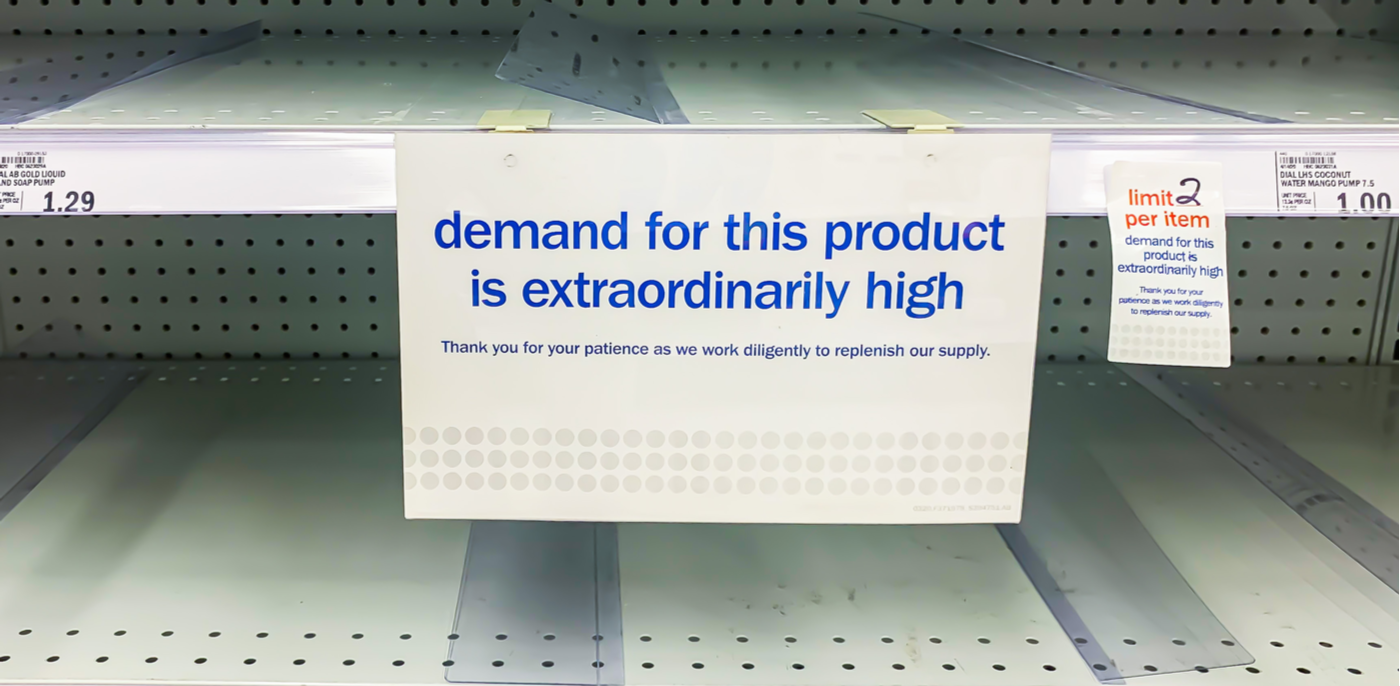
Humans by nature are curious and the minute you tell them that they aren’t utilizing the capabilities as efficiently as some others are, the great Fear Of Missing Out (FOMO) kicks in. There’s a psychological factor in play.
That being said, it also acts as a major factor of motivation and self-satisfaction if you know you have almost achieved your goal or are utilizing the platform to its maximum capacity.
Tap into this simple human psychology!
You still need to understand the need to divide milestones into smaller chunks or you may end up losing the end user’s interest.
A simple and relatable example: How would you feel when asked to do 30 push-ups vs. when asked to do 6 sets of push-ups with a break of 2-3 minutes and with each set having only 5 push-ups?
The second option sounds more doable, right?
Another point you must keep in mind while showing a progress bar is to never start from Zero or a null state! In all our experience working with leading online brands, we’ve learnt that users taking the effort to be present on your platform constitutes 10% of progress in itself. Ensure you show that to them and appreciate them for just being there!
Tooltips

Tooltips are a great way to guide your users and help them discover hidden features at the right moment and increase adoption. Tooltips can also be a great way to divert your user’s attention towards new enhancements or features that you would release.
We recently worked with a leading Ride-Hailing app that noticed a huge spike in their app uninstalls. On digging deeper, we helped them unearth that users who aren’t able to book a ride after a few attempts get frustrated and end up uninstalling the app. Simple but massive insight, right? Users who don’t benefit from the value that your promise won’t stick by you.
Solution: We helped them create a segment of users facing this issue. and The next time any user that falls into this audience group was then shown a Tooltip – guiding them towards the capability of booking a ride in advance.
Guide your users with directional markers such as this and witness first-hand how app stickiness and retention can increase!
Empty States
One question that is frequently asked is “Why do I have to show an empty state when I can use this space to show demo data to my users?”
Well, you can definitely experiment with that and see if it works for you.
But based on our experience, if the users want to see demo data, he would go to a demo login and not be in your live production environment.
Empty States can do what other listed Product Bumpers can’t. But, with more canvas to play with. This is a perfect opportunity to guide and explain to your users where they are and what actions they need to perform to achieve their goals. This canvas can be beautifully used to show what their Straight Line Path is and how far away from achieving their goals they might be.
3. Conversation Bumpers
In simple terms, these are hacks that you can deploy to get the user back on to your platform.
Here is a list of a few that work best:
- Welcome Communication
- Case Studies
- Usage Reviews
Welcome Communication

Welcome communication is a must-have anytime a user signs up on your platform. However, it’s important to nail this since it is the first time that the user receives any sort of communication from you. This also helps you lay the foundation for your future communication. There is always this urge to highlight all your features and benefits in this communication.
But, from what we’ve observed while working with top brands is that it’s best to use this as an opportunity to just introduce yourself – who you are and what problem you will help solve.
Straightforward, right?
There’s more to it, and we’ll let you in on an effective tip!
The problem you’re trying to solve may not necessarily be the same for each user. So, use this to your advantage and personalize such communication to them by understanding at the time of signing up why they want to use your platform.
Case Studies

The general perception about sending case studies is a great way to show how other customers are benefiting from using your product. But, go one step further!
Do a deep-dive study of why users have stopped using your paid platform, why they didn’t convert from a free trial to a paid version.
Once you have identified the key reasons behind your customers’ reluctance to use your platform, use this as an opportunity to tackle this problem right now when the customer is new to your platform by answering the questions or concerns which he/she may have in the future. Use this as an opportunity by showing successful case studies of customers who are benefitting from this, irrespective of the hurdle.
Let’s look at a situational example: You have regularly received feedback that your platform is not very user-friendly. Take this challenge head-on and present case studies of how customers can get started on their own instantly and achieve their goal in a few simple steps. Use this opportunity to showcase how your platform was designed to be DIY from day one.
Usage Reviews

This is a great Conversation Bumper to keep your users engaged. Now, there are two ways of using this.
- For your regular users, send them a usage report to keep them hooked, give them ratings, show them how they are performing better than others, or show them how they are improving over time. Use this window to give them a weekly snapshot of what they have achieved using your platform.
- For users who aren’t using your platform regularly, sending them the same weekly report explaining to them the same doesn’t make much sense.
Instead, take this as an opportunity to showcase what you have done this week for other users. Highlight how your platform achieved its goal by helping X set of users, how you’re growing daily, how your platform that used to touch 100 million users last week has now touched 10% more users. This invokes curiosity in the user’s mind to see what they are missing out on.
Become a True Product-Led Growth Company!
Understand your users and align your product-led growth strategy to their behavior.
Remember that your users are individual humans. Unique personalities. With their own set of needs, wants, expectations, preferences, and attitudes. They are naturally the happiest when they are recognized, valued as individuals, made to feel safe and in control of their own experiences on your platform.
Product bumpers will act as a guiding light to your users and your most trusted tool to ensure brand loyalty and skyrocketing revenues.
Here’s our honest attempt at simplifying these high-impact concepts for you. And, to understand how we can get your mobile app or website kickstarted on this data-driven and customer-centric journey, get in touch today!
