Tooltips are an invaluable component of user interface design. To enhance the user experience. To guide, to clarify, and to help the user discover features, functions, and products. When thoughtfully implemented, tooltips can significantly improve user engagement, satisfaction, and the overall usability of digital products.
These little nuggets of information act as your users’ personal guides. They provide valuable insights into features and their benefits during user onboarding and product tours. Think of them as friendly FYIs, that empower users to make the most of your app’s functionality.
In this blog, we will help you discover the power of tooltips and how they can be your secret weapon for an enhanced app user experience.
What Are Tooltips?
Tooltips are small, contextual messages or hints linked to a particular UI element. They provide information and guidance to users within a digital product. They typically appear when users hover over or interact with specific elements, such as buttons, icons, or features. Tooltips serve as a helpful layer of guidance through product tours. They offer concise explanations, instructions, or additional details to enhance the user experience.
Here are a few reasons why tooltips are valuable tools for guiding users within a digital product:
Clarity and Understanding
If you want your users to better understand the purpose and functionality of different elements within the interface, use tooltips. Well-defined and contextually placed tooltips provide clear explanations and prevent confusion or uncertainty about how to interact with specific features.
Discoverability
Tooltips enable users to discover hidden or less obvious functionalities and features that might otherwise go unnoticed. They provide insights and suggestions that encourage users to explore and take advantage of the full range of capabilities offered by the product.
User Onboarding and Learning
Tooltips play a crucial role in user onboarding. They guide users through initial interactions. They explain key actions and highlight important features. That’s how tooltips can shorten the learning curve. They make it easier for users to get up to speed and start using the product effectively.
Error Prevention
Well-designed tooltips can proactively address potential user errors or mistakes. By offering tips, warnings, or best practices, tooltips can help users avoid common pitfalls and make informed decisions. This reduces the likelihood of errors or frustration.
Efficiency and Productivity
Tooltips can streamline user workflows and improve efficiency. By providing shortcuts, quick tips, or time-saving suggestions, tooltips empower users to navigate the product more efficiently. This enhances the users’ productivity and overall satisfaction.
Accessibility
Tooltips provide additional information and context that makes it easier for users to access and use different functions and features more effectively.
Informative tooltips are the unsung heroes of user engagement. They’re the perfect tool to seamlessly integrate helpful advice into the user experience or to shed light on hidden gems for future use.
? FedEx’s tooltip for providing additional information for the shipping form fields is an excellent example of an informative tooltip.

But here’s the best part: informative tooltips don’t disrupt the user’s flow. They don’t demand attention or action but instead offer gentle reminders, updates, or a heads-up. They inform users about a feature or offer but also allow a user to continue their journey uninterrupted. That’s why you’ll often find passive CTAs like “Got it” or “Ok, understood” accompanying informative tooltips.
When it comes to UX writing, informative tooltips avoid leading with active verbs. They aren’t bossy or directional. They elegantly demonstrate how to enhance the user experience without overwhelming users with excessive guidance.
On the other hand, instructional tooltips are the charismatic motivators of action. They nudge users towards specific tasks. They use verbs that command attention.
? Look at HubSpot’s instructional tooltip. It guides and shows users how to create filters for contacts. This tooltip informs and also motivates towards action.
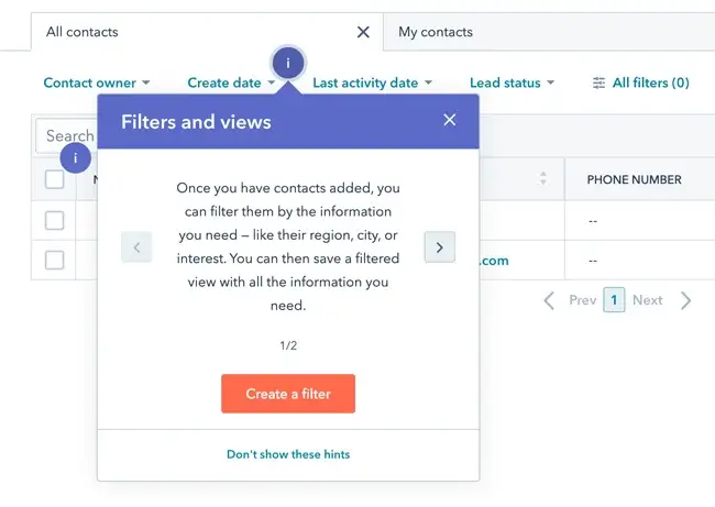
Instructional tooltips are not just for user onboarding. They work wonders for feature adoption and re-engagement too. They possess the unique ability to entice users towards the next desired action and create a habit loop. Think about your favorite gaming app – chances are, it employs instructional tooltips to guide you through each exhilarating level.
Even e-commerce apps utilize instructional tooltips to encourage you to add products to your cart or seamlessly navigate the checkout process. Here are some captivating examples to prove that tooltips are invaluable to educate users about your app’s features, showcase their best use cases, and ultimately deliver value.
Let tooltips be your silent champions, that guide users toward discovery, engagement, and empowerment. With their help, you’ll elevate the user experience, one tooltip at a time.
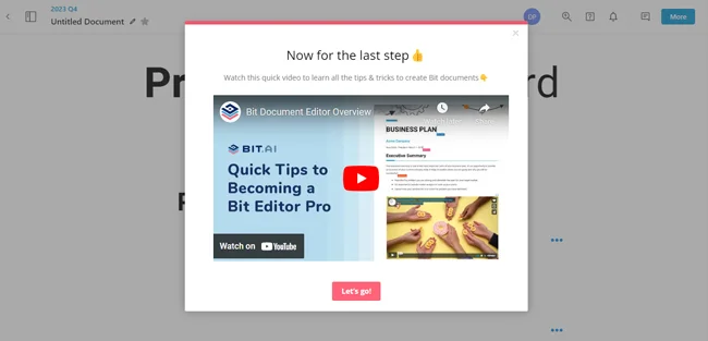
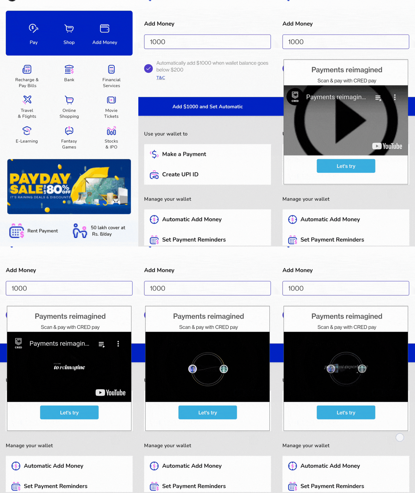
?Tip: To make your instructional tooltip more valuable and effective, try adding a YouTube video within the tooltip that can help your users understand the purpose of the feature/utility you want them to adopt
The Pitfalls of Bad Tooltips

When you open the Unacademy app on your phone, a tooltip appears on the Search feature. Why is this tooltip bad? Because it’s clear from the design that the Search section is where users can look for new goals and courses. The tooltip here, on content is redundant since the Search Bar is clearly visible and already has copy that instructs the user to ‘Search Goal.’
The tooltip here is being used as a shortcut to prompt users to do what the product manager wants (explore new content). Unfortunately, it’s not as easy as that — you cannot simply just add tooltips to create engaged users.
This tooltip doesn’t provide any new value; the interface element is already easy to understand, making the tooltip redundant and annoying.
Users take action because they are motivated, have the ability, and are prompted by a trigger, which means tooltips will only succeed when the user understands the value proposition and the interface is intuitive.
Tooltips are a great way to provide users with additional information about an interface element. However, if they are not designed well and presented contextually, they can actually do more harm than good.
Create Tooltips Using These Guidelines
Common mistakes and characteristics of poorly designed tooltips YOU MUST AVOID:
- Too much text: Users are less likely to read long content.
- Jargon or technical terms: Write in plain language that is easy for everyone to understand.
- Confusing or ambiguous language: If users are left wondering what the tooltip means, they are less likely to use it.
- Not enough context: Always provide information that is relevant to the interface element that the tooltip is attached to.
- Not consistent: Tooltips should be consistent in terms of their style, format, and content.
Bad tooltips can have a number of negative impacts on user experience and engagement. They can:
- Confuse users: If users don’t understand what a tooltip means, they are less likely to use it. This can lead to frustration and a decrease in user satisfaction.
- Frustrate users: If users have to click on an interface element multiple times to get the information they need, they become frustrated. They will abandon the task they are trying to complete.
- Overwhelm users: If there are too many tooltips on a screen, users can become overwhelmed. This can lead them to ignore the tooltips altogether.
It is important to design tooltips carefully to avoid these negative impacts. By following the tips above, you can create helpful and informative tooltips that improve the user experience.
Tooltips are used to:
– highlight important parts of the screen
– create a focal point
– announce specific changes or updates
– remind a long unused key feature
To design effective tooltips, you need to bring together the following elements:
Timing:
Pay attention to tooltips and related design techniques during the sketching and early prototyping stages.
Implementation:
Carefully consider tooltip context, placement, and clarity. While they should be prominent and easy to find, tooltips should not obstruct important information on the screen.Context:
The principle of attending to context applies to all aspects of UX and UI design. It’s especially important for tooltips because their necessary brevity will leave users confused if the context is not clear. Being more contextual also includes clarity and brevity. Make sure you remember to keep editing and condensing the content and the context of your tooltips.
Learn from Great Examples
Slack
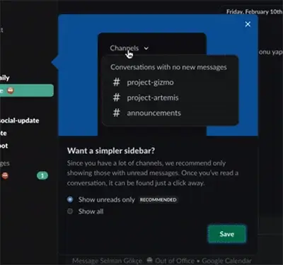
Slack prompts users with a tooltip featuring a GIF and a two-option preference setting to promote its new feature.
Why is this a great tooltip?
✅ Minimal design – The tooltip is small, and has short copy. Also, it is a single-step user onboarding. It makes the information easy to digest even when it seems out of context.
✅ Animated content – The GIF added to the tooltip makes it easier to understand how exactly the new feature functions.
✅ Engaging copy – The copy at the top of the tooltip that reads “want a simpler bar?” focuses on the user problem and provides a solution to it through the content – a good example of copy that draws attention.
Evernote
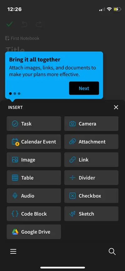
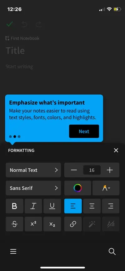
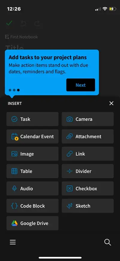
Evernote brilliantly uses a combination of tooltips as a product tour to get new users familiar with the interface and features as they move through the app.
Why is this a great example?
✅ Tooltip description – The short tooltip description explains why a feature would be used (“capture thoughts and ideas when inspiration strikes”). By providing a simple use case, Evernote helps improve new feature adoption and gives users a reason to check out the new feature.
✅ Indicates progress – Evernote adds a “Next” button on the bottom of the tooltip to indicate that it is a walkthrough and that by clicking on Next the user will be able to go ahead and explore another set of features.
✅ Provide context – When these tooltips are displayed, Evernote highlights them with either ablue border or a hotspot as a supportive element to add more context.
Google Pay
Google Pay intelligently uses tooltips by highlighting the core action that correlates to long-term retention. Consequently, these tooltips make the user perform these vital activities in the first few minutes of user onboarding.
Why is this a great example?
✅ Indicates core action – It highlights the core action that will help the app achieve more conversions.
✅ Tooltip copy – The description is clear. The content highlights the core benefit of using the app and convinces users that this is an important feature they have been looking for all along.
✅ Instruction over information – Since this is an instructional tooltip, Google Pay does not add any buttons. It gently instructs users to go ahead and perform the core action instead of delaying it.
Bajaj
Bajaj Finserv uses tooltips to remind users of upcoming payment deadlines. This is a great way to use a tooltip as it serves the purpose of a contextual, non-intrusive reminder at intervals of every one or two weeks.
Why Bajaj is a great example?
✅ Uses tooltips contextually – Not to promote a random feature or offering but to remind users of an upcoming payment deadline that is important.
✅ Descriptive tooltip – The tooltip is descriptive and to the point in the way it conveys the message. It reminds the user about renewing their insurance policy while indicating the number of days left until the expiry of the policy and gives them a call-to-action to motivate a response.
✅ Image + Text – The tooltip blends image and text really well to make the content more attractive. Just text without an image or an offer wouldn’t be enticing enough for the users to stop and notice it.


Starquik
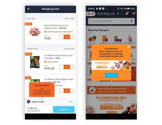
Starquik uses tooltips to remind users to redeem their existing coupons and discounts. Placing a tooltip on the right element and firing it at the right time helped Starquik improve its Coupon Redemption Rate by 26%.
Why Starquik is a great example?
✅ Contextual reminder – Starquik’s tooltip works as a contextual reminder to redeem coupons on their purchase. They are placed right at the time of checkout.
✅ Descriptive tooltip – The tooltip content perfectly describes the coupon offer and entices users to avail of the benefit in their current purchase.
✅ Reminder as an instruction – This tooltip not only reminds users but also instructs them to avail of the coupon, pushing them towards making a choice that eventually leads to a 26% coupon redemption rate.
Why, When, and How to Use A Contextual Tooltip
Tooltips can provide a number of benefits for users, including:
Increased clarity and understanding:
Tooltips can help users understand the purpose and function of interface elements, which can lead to increased clarity and understanding of a product or service.Improved usability:
Tooltips make it easier to use a product or service, by providing information users need, when they need it.Reduced frustration:
Tooltips can help reduce frustration by providing users with the information they need to complete tasks without having to search for it.Increased engagement:
Tooltips increase engagement by providing users with additional information that makes a product or service more interesting and engaging.
When to Use Tooltips
Tooltips should be used strategically to provide users with the information they need when they need it. Some good times to use tooltips include:
- When an interface element is unfamiliar or complex.
- When an interface element has multiple functions.
- When an interface element has a keyboard shortcut.
- When an interface element is used infrequently.
How to Implement Tooltips Effectively
To implement tooltips effectively, follow these best practices:
- Use clear and concise language
- Use a consistent style
- Place tooltips in a visible location
- Test tooltips with users
Follow these best practices to implement tooltips effectively and improve the user experience.
How to Customize Tooltips
There are a number of ways to customize tooltips and make them more engaging and interactive:
Use hover effects:
For more visual appeal and to draw users’ attention.Add animations:
To add interest and excitement to tooltips.Use multimedia elements:
Use interactive elements such as images, videos, and audio to make tooltips more informative and engaging.Add text in your user’s preferred language:
This will make your tooltips accessible to a wider range of users.
Examples of Interactive Tooltips
Here are a few examples of using interactive elements within a tooltip:
- A tooltip that shows a video tutorial when the user hovers over it.
- A tooltip that plays a sound when the user clicks on it.
- A tooltip that opens a pop-up window with more information when the user clicks on it.

Conclusion
Product teams can leverage the power of no-code tooltips to create intuitive and engaging user interfaces. The process of implementing in-app guidance becomes more accessible and efficient when you have the support of the right software.
A digital adoption platform like Netcore’s Product Experience supports Poduct Managers in their quest to make product adoption and engagement easier without the usually extensive technical or engineering support needed to design and deploy such interactive tooltips.
Take the next step to find out how you can create tooltips that are engaging and interactive with Netcore’s digital nudges.


